Description
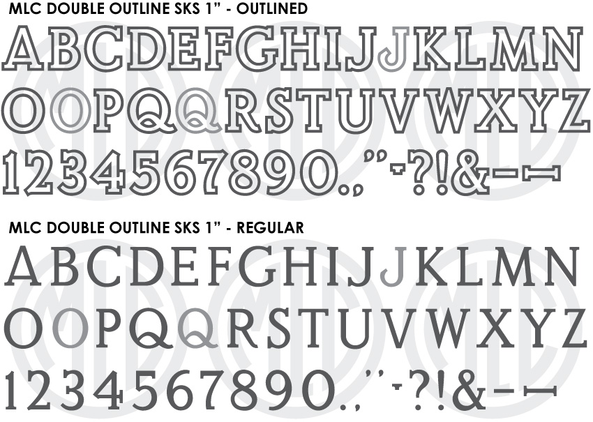
* Only the basic character set is shown here. For a sample character map see the MLC Font Project page. Alternate characters shown in grey.
Classification
Monument Roman: Bold/Outlined
Usage
Created as a plastic alphabet for cutting sandblast stencil, the SKS Double Outline has seen consistent usage since it’s creation in 1968, however the 1″ size differs significantly from the larger sizes and has rarely been digitized. Though it may still see some rare usage, due to its lack of digitization it has seen a decline in usage since the digital era began.
History & Designer
The MLC currently has no information on the designer of the alphabet, but there is no doubt that it was based on the Spacerite Double Outline alphabet which preceded it. The Spacerite Double Outline included nearly identical alternates for ‘O’, ‘Q’, and ‘J’. The alternate ‘J’ is specifically similar. The SKS Double Outline alphabet contained 3 distinct styles at specific size breaks (1″, 1.25″-1.75″, and 2″-3.5″). The MLC created an outlined an non-outlined version of each, in order to match lettering at any size. Due to the sizable differences in the design of the 1″ alphabet, the MLC separated the fonts into two groups (Small and Medium-Large) which will nest together when all are installed.
At times, memorial manufactures have used the SKS Double Outline alphabet to created a non-outlined Roman letter by removing the inside section of sandblast stencil after pressing the letters. While this is less common at the 1″ size than the larger sizes, a non-outlined version at each size has been included in order to match these inscriptions, and for the ability to add a custom outline thickness to the letters.
Distinguishing Features
At all sizes, the leg of ‘R’ distinguishes this alphabet from other Outlined Roman styles. Rather than being curved, the leg is straight until it reaches the baseline and hooks upward. The crossbar of ‘4’ is shorter as it exits the right side of the vertical stroke than it is in any other Monument Roman alphabet, giving it a stunted look. The SKS Double Outline alphabet contained 3 distinct styles at specific size breaks (1″, 1.25″-1.75″, and 2″-3.5″). The relative outline thickness also changes at these sizes. Due to the considerable differences in the design of the 1″ alphabet, the MLC separated the fonts into two groups (Small and Medium-Large) which will nest together when both licenses are purchased and all versions of the font are installed.
View the MLC Double Outline SKS 1.25″-3.5″ (Medium and Large sizes).
Characters
The MLC added some punctuation and special characters, including an ampersand. The SKS Double Outline alphabet contained several alternate characters; a second wider version of ‘O’, and ‘Q’, as well as an alternate ‘J’. The MLC included these alternate characters as OpenType alternates when using software which supports OpenType features.