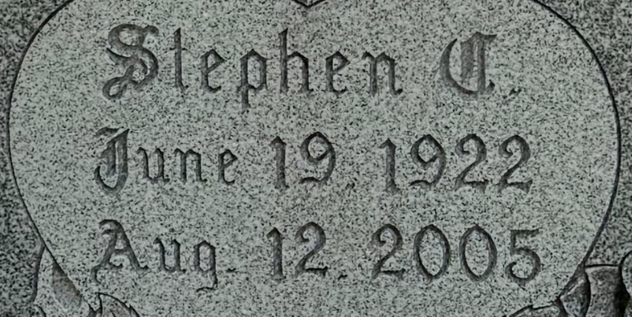
Hi Paul, this is the old metal Spacerite Old English alphabet, which would have either been hand-cut, or this is possibly a digital version. The 1’s are actually upside down, because the metal letters had a larger empty space below the number than above it, which is why they are lower than the other numbers.
I have created a digital version, which is available in the dfont shop. However, it appears the version in this photo is slightly bolder, so it may need to be given a slightly stroke/outline to match more closely: https://www.monumentletteringcenter.com/product/mlc-spacerite-old-english/
 .
.