Description
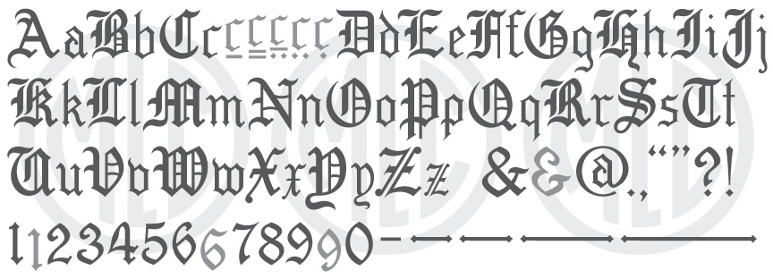
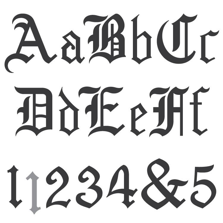
* Only the basic character set is shown here. For a sample character map see the MLC Font Project page. Alternate characters shown in grey.
Classification
Blackletter/Old English
Usage
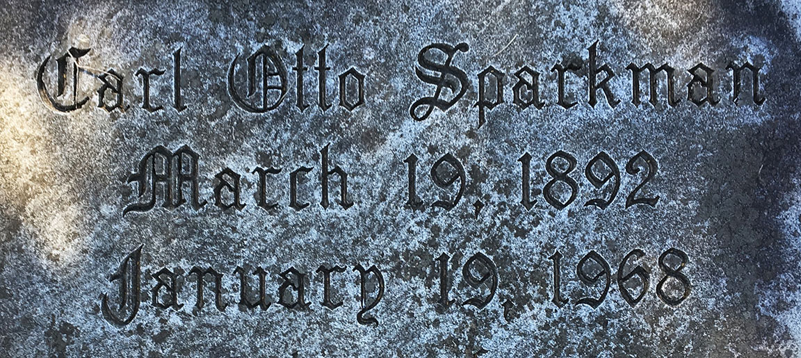
Created for the monument industry for sandblast work, this alphabet has typically (and correctly) been most often used on monuments designed in a gothic style. The alphabet saw most of its usage from the mid-1930s until the 1950s while the gothic style was more commonplace than it is today. It has, however, always seen some usage due to its digitization in various monument software including Monu-Cad, Cochran’s Monumental Designer, and the now defunct Craftech.
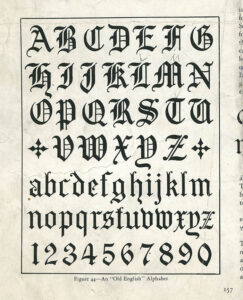
Example alphabet used as inspiration for the Spacerite Old English alphabet. (Thomas E. French, Monument and Cemetery Review, circa 1930).
Designer
Previously unknown by the MLC, it is now confirmed that the designer of the alphabet was renowned drafting instructor Thomas Ewing French. French was a draftsman, and later a mechanical/engineering drawing professor, and wrote many books on the subjects of mechanical drawing and lettering. During the 1920s or 30s, French also wrote a series of articles for the Monument and Cemetery Review (the publication of Harry A. Bliss) aimed at lettering for the purpose of sandblasting. As part of the series, French focused one article on the Gothic Blackletter, where several example alphabets were included. The Spacerite Old English alphabet drew from two separate examples–the uppercase and numerals from one alphabet were used without change, along with a mixture of a modified lowercase from the same alphabet and a separate simplified lowercase designed specifically for raised lettering. It is possible that the Spacerite Company hired French to draw up the letters, but it is also possible that they were redrawn by Timothy Jellow, one of the two original partners of the Spacerite Company who likely designed the company’s first 3 alphabets.
History
The Spacerite Old English alphabet was the 4th monument font created by the Spacerite Company. The exact date of creation is unknown, but it was between 1927 and 1935. The name “Old English” is actually a misnomer, as there is nothing specifically English about the origins of the style, but was developed all over Western Europe, specifically in Germany. The correct term for the style of lettering is “blackletter”, which was often used for manuscripts and created with a broad nib pen using only two main angles–one around 45° and another entirely vertical for thin downstrokes on the capital letters and other small features.
Distinguishing Features
The form of the letters in this alphabet is of a typical traditional blackletter style, which can be seen in many vintage lettering books. The numerals, however, are quite unique, abandoning the more ridged vertical strokes typically kept by blackletter alphabets and adopting a more organic feel. The numerals are also smaller than the capital letters, about 85% of the cap height.
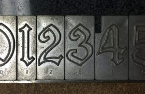
Metal Spacerite Old English numbers. Notice the unequal distance between the top and bottom of plates.
Characters
The original metal alphabet contained no punctuation or dashes, though it is unknown if the Spacerite Company ever produced any. The MLC created all punctuation, including dashes and an ampersand for the font based on memorials found in the cemetery where the alphabet was used. An alternate ampersand is included in the font, which was created by vertically flipping and enlarging the ‘3’ and adding a small horizontal stroke. The MLC also included alternate versions of the numbers ‘1’, ‘6’, and ‘9’; which were sometimes flipped upside down, dropping them below the baseline due to the non-centered alignment on the metal plates. These alternates and dash ligatures have been included by the MLC as OpenType features when using software that supports them.

