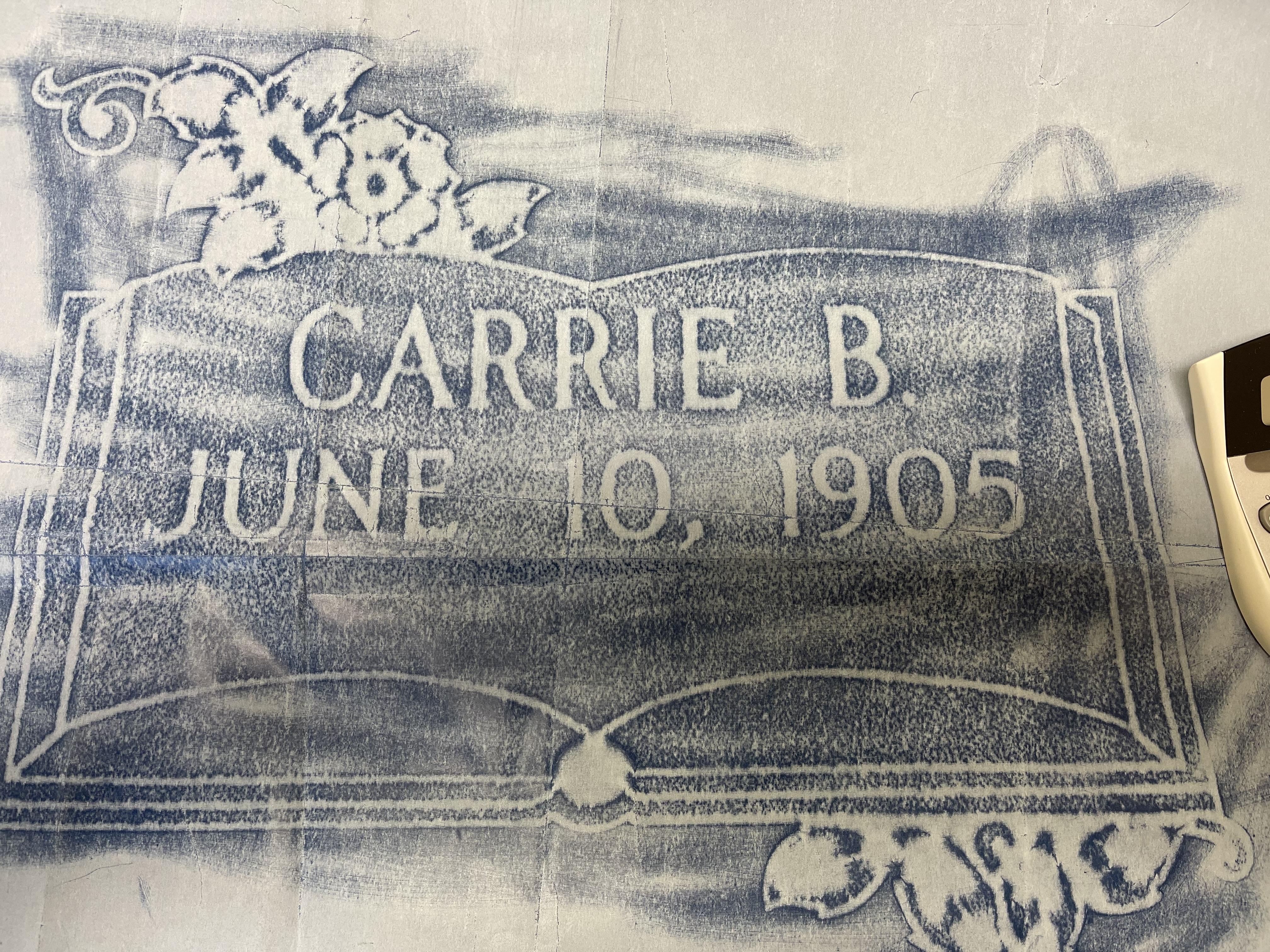
FONT HELP. Looks like Handcut Mod Roman but seems too bold
- This topic has 1 reply, 2 voices, and was last updated 4 years, 8 months ago by
 .
.
Viewing 2 posts - 1 through 2 (of 2 total)
Viewing 2 posts - 1 through 2 (of 2 total)
- You must be logged in to reply to this topic.