
MLC

Forum Replies Created
-
AuthorPosts
-
 MLCKeymaster
I believe the Modified Roman may be from SignLab.
The Condensed Roman is something I’ve had a customer use the inscription matching service for, but am unsure of which software it comes from. I’ve only seen it one or two other times. It could possibly be from a less popular monument design software, or perhaps one that is no longer available.
MLCKeymasterYes, this is a font called Romic Light. It can be purchased here: https://www.myfonts.com/fonts/adobe/romic/light/
MLCKeymasterHello, this is in all likelihood hand-drawn or perhaps a custom letter set. During the early 1980s there were no digital fonts available to the industry, and only two Lombardic Uncial style alphabets available to the monument industry as physical lettering sets or metal sheets.
If you need only a ‘2’, a zero, and a dash, this should only take a few minutes to match, as you have all the information you need on the stone. If you’d like help feel free to utilize the matching service: https://www.monumentletteringcenter.com/product/cemetery-inscription-matching-service/
MLCKeymasterHello, unfortunately, this is custom lettering and I’ve never seen a font that will be remotely similar to this. Your best bet will be to match this by hand, or utilize the MLC Inscription Matching Service: https://www.monumentletteringcenter.com/product/cemetery-inscription-matching-service/
MLCKeymasterHello, this is a font called ITC Novarese, or perhaps a slightly different version. Monu-Cad has a version called DS Covenant.
MLCKeymasterHi Eric this is Zapf Chancery Bold: https://www.myfonts.com/fonts/itc/zapf-chancery/pro-bold/
MLCKeymasterHello, I’ve never seen any reproducible letter set like this before, but I have seen some inscriptions which were somewhat similar. It does look too consistent to be hand-drawn, so it’s possible this was a custom letter set made out of wood or some other material.
Unfortunately, you’ll need to match this one manually. As always, if you need help feel free to utilize the inscription matching service: https://www.monumentletteringcenter.com/product/cemetery-inscription-matching-service/
MLCKeymasterHello, this is all originally custom, hand drawn lettering. You can see the slight differences from letter to letter in the earlier inscriptions. Nearer the bottom you can see that the Spacerite Classic Roman alphabet has been used for some characters (‘A’, ‘D’, ‘L’, ‘I’, ‘B’, ‘1’, etc.), while other more eccentric or noticeable characters were modified by hand to match the earlier inscriptions (‘R’, ‘H’, ‘S’, ‘6’, ‘9’, etc.).
You can see how some characters have changed quite dramatically from the top to the bottom lines (‘A’, ‘2’, ‘3’).
This all creates a difficult situation for the individual adding subsequent information. Do you match the last inscription or the first? Or do you try to morph the characters to be somewhere in between?
Either way this will need to be custom matched. Please reach out if you would like to utilize the inscription matching service: https://www.monumentletteringcenter.com/product/cemetery-inscription-matching-service/
MLCKeymasterHi Randy, this is a Monu-Cad font called Smith Consensed SIP. Unfortunately, there is currently no known digital font available outside of Monu-Cad. If you’d like any help matching it feel free to use the matching service: https://www.monumentletteringcenter.com/product/cemetery-inscription-matching-service/
MLCKeymasterYes, this is a font called Scriptural Art, an old metal Spacerite letter set designed by architect and memorial draftsman Conrad Kenerson. The only digital version I am aware of is in the Monu-Cad software, where it was renamed “MG Script”.
There are plans to make a version for the Monument Lettering Center, but it is currently down the queue quite a ways.
If you’d like help matching the font, feel free to utilize the matching service: https://www.monumentletteringcenter.com/product/cemetery-inscription-matching-service/
MLCKeymasterYes, this is a version of Garamond. Unfortunately, there are probably more versions of Garamond available than there are for any other font and this is not an obvious version. American Garamond or ATF Garamond my be a good base to start with, but would both still need to be modified to match. This version appears to be slightly more condensed than most non-condensed (regular) versions.
MLCKeymasterThis is hand-cut lettering where the original metal Spacerite Modified Roman letters were used to layout the inscription. The MLC has created a font to match this type of lettering, but due to the hand-cut nature, there are often still some differences. In this case the serifs seem to be somewhat longer than the MLC version, and would need to be manually modified to match.
Here is a link to the font: https://www.monumentletteringcenter.com/product/mlc-spacerite-modified-roman-handcut/
The crossbar on ‘A’ also seems to have been manually dropped down from the original metal letters. However, the MLC version of the font has an alternate character available to match this letter, when using software that supports OpenType alternates.
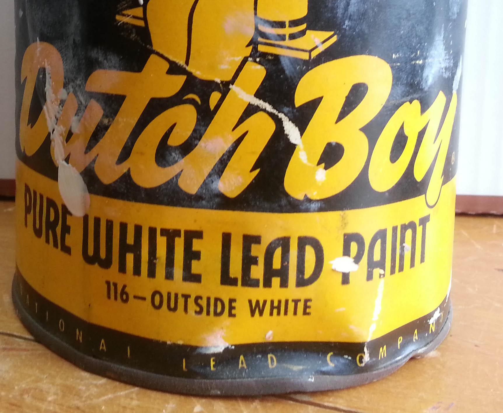
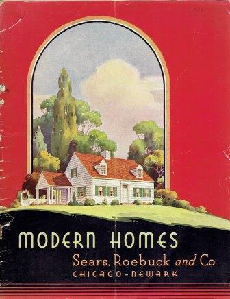
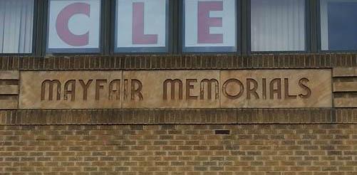
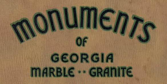
MLCKeymasterHello, this is just a variation of the Vermarco alphabet, likely either all hand drawn, or perhaps some letters are from the Spacerite letter sets (the first standardized version in the industry). Because Vermarco is based on various Art Deco lettering styles of the 1920s and 30s, you see many similar styles that continued to be used throughout the 1940s and 50s in advertising.
It was a hugely popular style of lettering, and this in turn influenced many variations by draftsmen in the memorial industry, who typically referred to the style as “modern” lettering, and often made changes to many different letters they didn’t like or wanted to add more style to. That style of ‘A’ was actually quite common, but no known reproducible letter set was ever made with this style. Attached are some examples:
 MLCKeymaster
Yes, this is a font called Baker Signet. If you don’t have it currently, it can be purchased here: https://www.myfonts.com/fonts/adobe/baker-signet
MLCKeymasterHi there, without seeing an image I can’t say for sure, but this is likely a hand drawn lettering style. If it is from the 30s it is almost certainly the case, as there were only a handful of styles widely available at the time as a reproducible letter sets. I do however have a number of photos of examples of similar hand drawn lettering on memorials.
If you would like help matching the lettering, feel free to use the matching service: https://www.monumentletteringcenter.com/product/cemetery-inscription-matching-service/
-
AuthorPosts