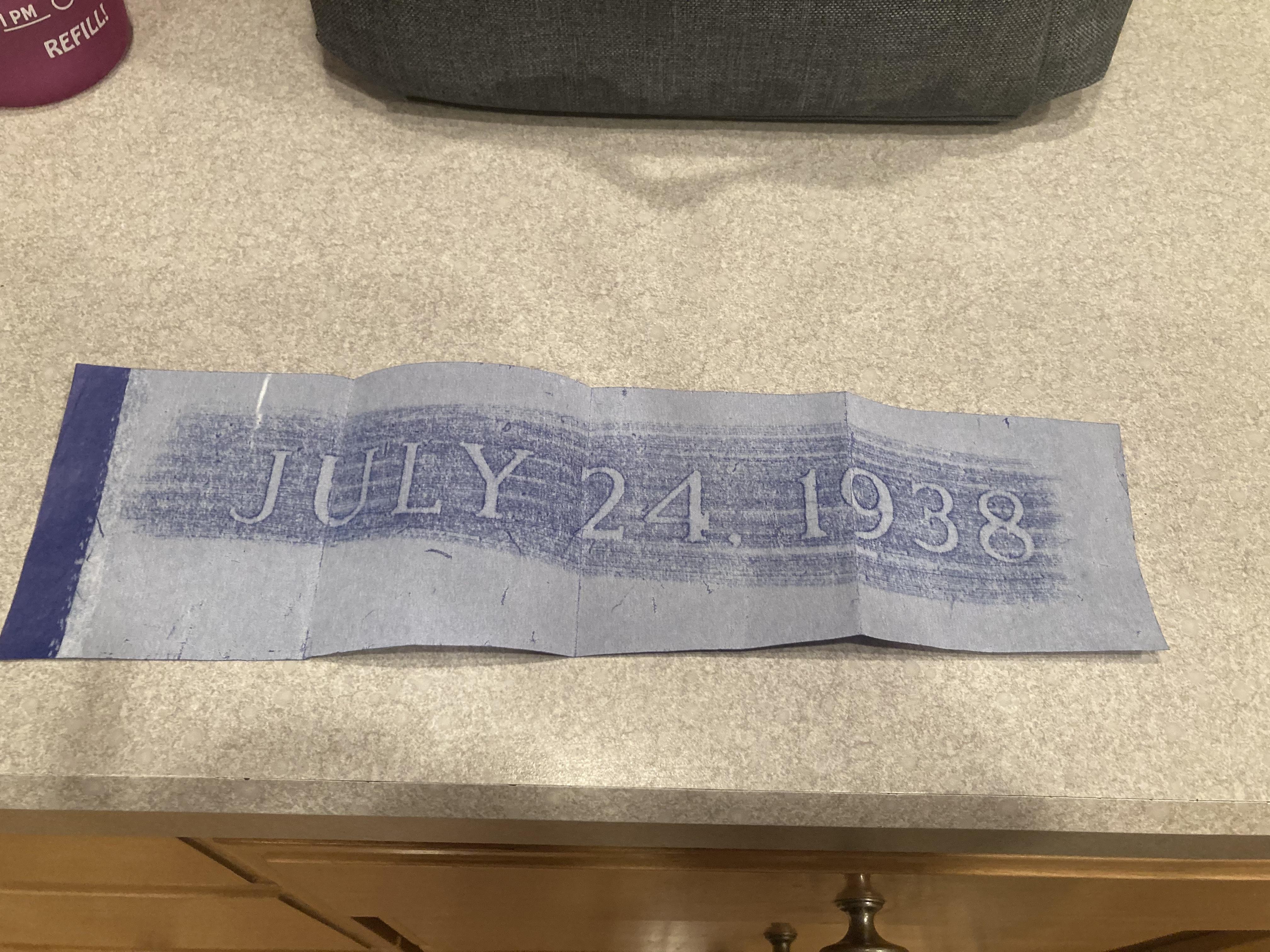
Close

Font question

Viewing 2 posts - 1 through 2 (of 2 total)
  • Author
    Posts
  • #4471
    Jill
    Participant

    Flat bottom 2. Any ideas? Thank you. 

    #4473
    MLC
    Keymaster

    This appears to be a slightly modified SKS Double Outline (without the second outline). Slightly bolder than the traditional Modified or Classic Roman, it appears that some of the spurs may have been manually cut off, which are present on the numeral ‘1’, ‘2’, and ‘4’ of the original alphabet. The numeral ‘4’ is the giveaway when identifying this alphabet, with the serif on the crossbar being so tight up against the stem.

    MLC ScotchKut Double Outline – Medium-Large

Viewing 2 posts - 1 through 2 (of 2 total)
  • You must be logged in to reply to this topic.