Which version of Modified Roman?
Home › Forums › Lettering and Font Identification › Which version of Modified Roman?
- This topic has 2 replies, 2 voices, and was last updated 5 years, 6 months ago by
grant.
-
AuthorPosts
-
December 26, 2020 at 2:07 pm #3648
grant
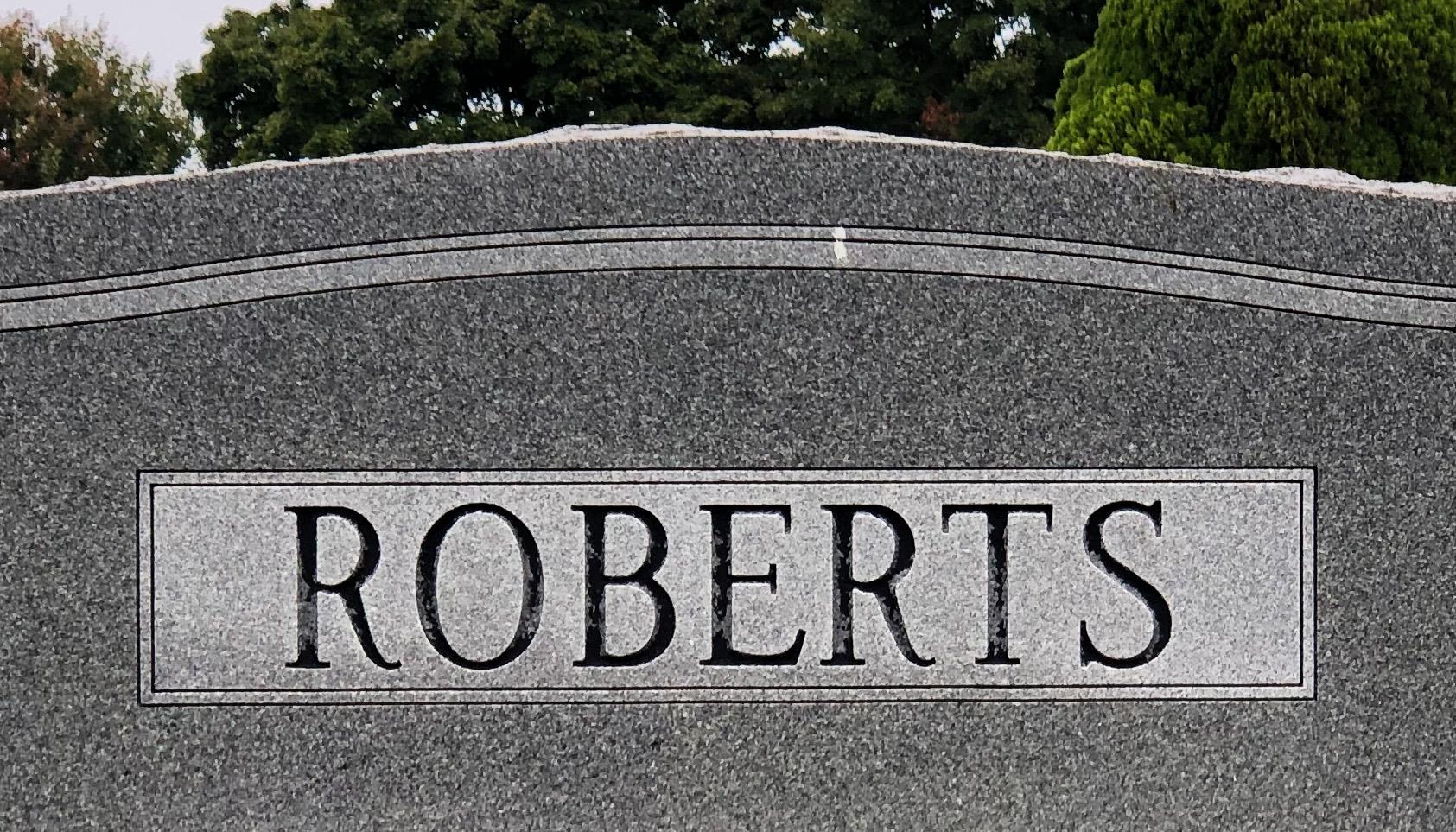
ParticipantHello, I’m trying to match the typography for my mother’s monument to the rest of her family. I recognize these samples are Modified Roman, but in various weights. I’m not familiar with the needs of stone lettering, but in print design we’d call the larger ROBERTS a display face, with higher stroke contrast and more delicate features.
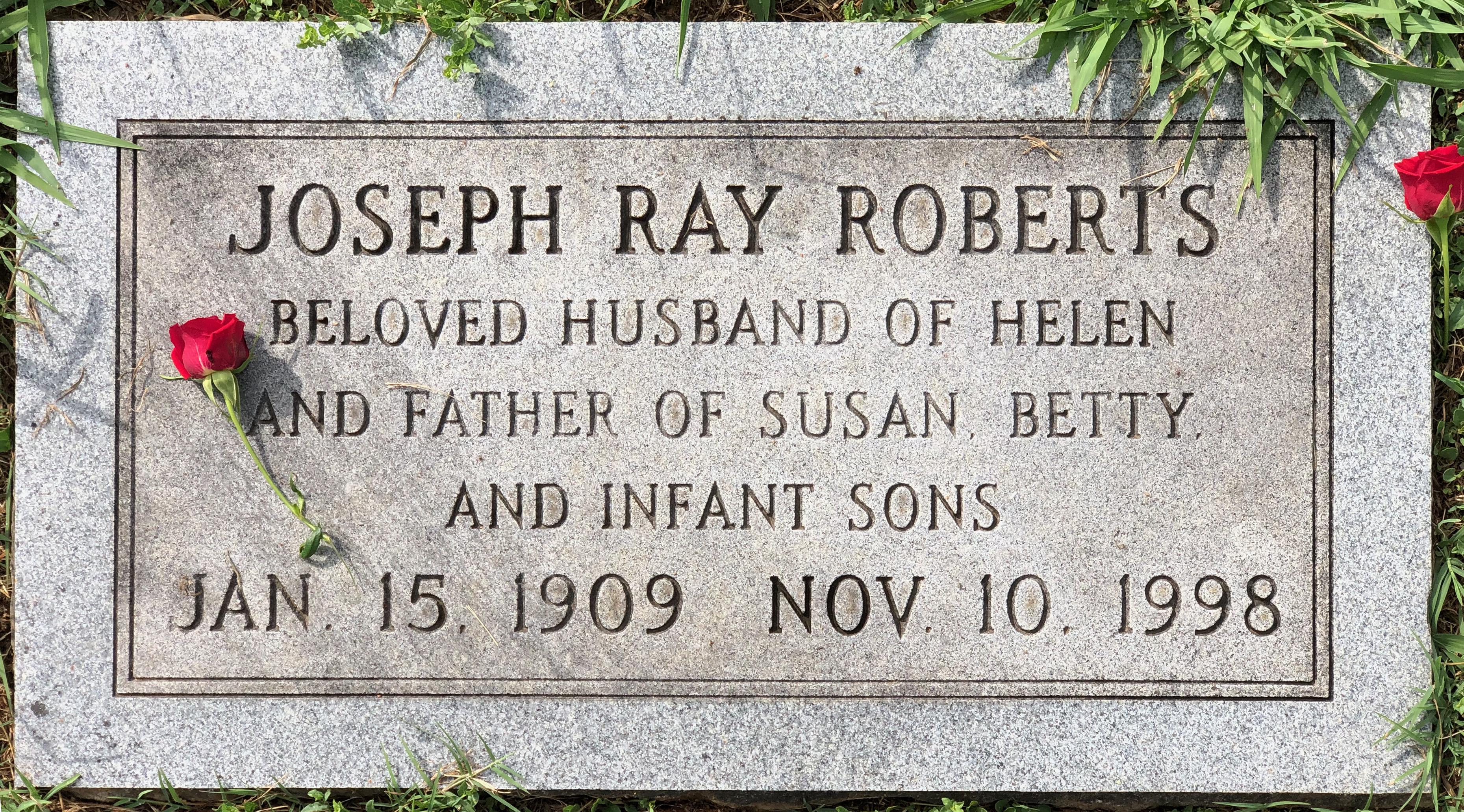
The flat headstone seems to have two heavier weights of the same family, for a total of three versions of Modified Roman. Of the various font files here on the website, there seem to be many variations based on the customizations made for different engraving technologies. I’m not sure how to match up what’s on the stones with what’s available on the web, so that I can make sure I’m giving the right instructions to the cemetery.
Does anyone here recognize how to match these up with what’s available?
By the way, I was so excited to find this website. It’s such a pleasant surprise to discover such a thorough and well-designed resource to help with a need I never realized I would have. Many thanks to the people behind it.
 December 28, 2020 at 1:16 pm #3650
 MLCKeymaster
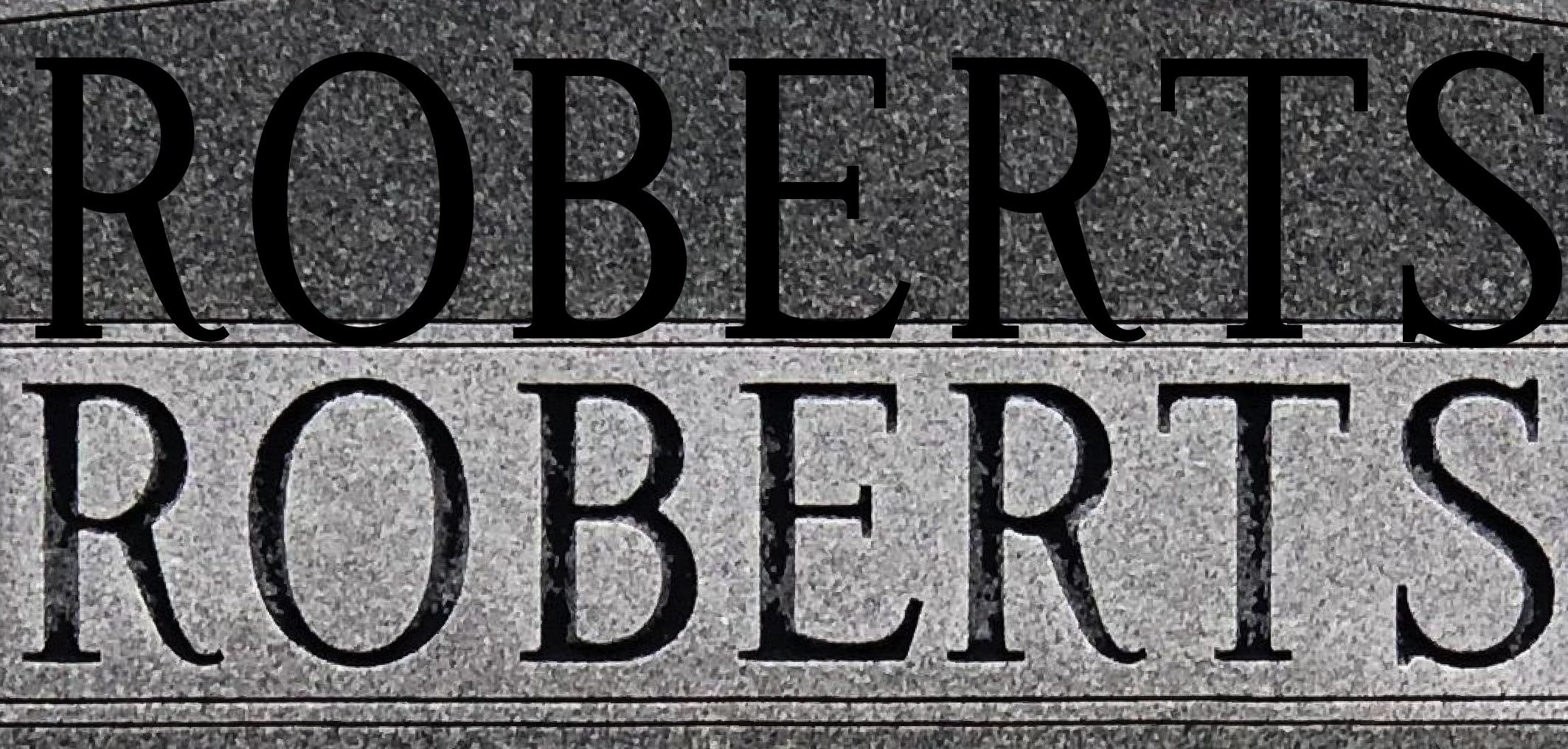
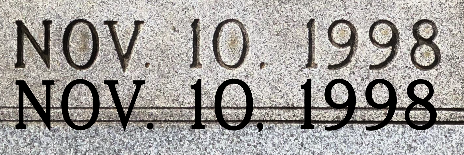
Hello Grant, thanks for reaching out. I believe what you’ve got for the family name is a digital font based on the largest sized sets of plastic SKS Modified Roman letters. Depending on their height, these sets of letters varied slightly in weight and serif thickness. You can see in the attached photo that there is some slight difference in the thickness of the stems, and thickness/length of some of the serifs–which is why this is likely a digital recreation of the original alphabet.
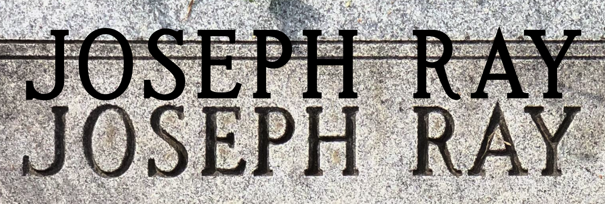
The flat marker looks to have a digital recreation of the SKS Modified Roman Heavy Bar. This was a separate version of the Modified Roman alphabet created with slightly heavier “bars” or stems. I believe the apparent difference in weight is only due to the difference in size, and that only one font was used on the marker. The original plastic letters of this style did not change based on their size. You can see in the attached photos that the general letter forms are very similar (except ‘A’ which seems to be backwards on the stone–and perhaps ‘V’ and ‘Y’ as well), though what you have on your marker again has slightly thicker stems than did the original plastic letters.
Unfortunately, most digital versions of these alphabets are included as proprietary fonts in specific monument designing software, and it’s unclear which software was used to create them.
Fonts used in the photos:
MLC Modified Roman SKS 1.25-3″
 January 13, 2021 at 12:46 pm #3691Participant
Thanks for reply. That’s very helpful, those look like close matches! I appreciate the work you do here.
GD
-
AuthorPosts
- You must be logged in to reply to this topic.