Description
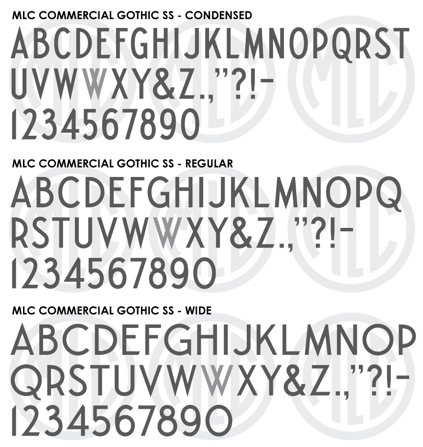
* Only the basic character set is shown here. For a sample character map see the MLC Font Project page. Alternate characters shown in grey. All three weights are included in the download.
Classification
Common/Commercial Gothic
Usage
This alphabet was designed for sandblasting, but could easily be used for hand carved v-cut letters. After it was printed as an example alphabet for the memorial industry in 1982, it was digitized in various monument design software including Craftech, Gerber Omega, and Monu-Cad. This style of letter should be used when legibility rather than beauty of form is most desired or needed. It also pairs well with modern or minimalist design, art deco design, and due to its simplicity works well when used as engaged or raised lettering.
History & Designer
This alphabet was printed in a series of lettering examples for the memorial industry in the 1982 American Monument Association book Symbols: The Universal Language. The chapter on lettering was written and drawn by Mike Johns and Ricky Tichy of the Johns-Carabelli Co. Because many of the lettering styles included in the book were based on existing alphabets, it is unknown at this time if the Commercial Gothic was original in design or a derivative of another.
Distinguishing Features
The lower horizontal strokes on ‘E’, ‘L’, ‘Z’, and ‘2’ are unique to this style, and the long tail of ‘Q’ which drops very deep below the baseline is also a distinguishing characteristic. The version drawn for the book was a condensed Commercial Gothic, having a very narrow geometry, something not common among Commercial Gothic alphabets. The MLC designed two extra weights, “Wide” which contains much broader geometry and near circular round letters like ‘O’ and ‘C’, and a “Regular” weight which is an exact average of the other two.
Characters
The alphabet was printed with no punctuation, and therefore all punctuation and characters have been created by the MLC, using existing versions as a guide. The MLC also included a second version of ‘W’ created by overlapping to ‘V’s. This alternate character is available as an OpenType alternate when using software which supports OpenType features.