MLC
Forum Replies Created
-
AuthorPosts
-
 MLCKeymaster
This appears to be hand-drawn lettering. Feel free to use the inscription matching service if you would like help matching it: https://www.monumentletteringcenter.com/product/cemetery-inscription-matching-service/
MLCKeymasterHello, this is a version of Zapf Chancery Regular, or Roman. It may just be the photo, but it does appear it may have been manually condensed.
MLCKeymasterHello, sorry for the delay. This is a font called Latin 725. It appears that at least some of it may have been manually condensed. There is also another verison called Meridien, and a third called Frutiger Serif. All three were designed by type designer Adrian Frutiger. Additionally, there is a version in Cochran’s Monumental Designer software simply named Latin.
MLCKeymasterThis looks like it might be a versoin of Condensed Roman only available in the Monu-Cad software called Individual Condensed, which has this version of the ampersand. The ampersand appears to have been stolen from a version of Times New Roman. If you use Gerber Composer, the ampersand from their version of Times New Roman-GSP ACCT AK REVA will match it very closely.
MLCKeymasterYes, this appears to have all been hand-drawn lettering and will need to be custom matched. Feel free to reach out if you would like to use the inscription matching service: https://www.monumentletteringcenter.com/product/cemetery-inscription-matching-service/
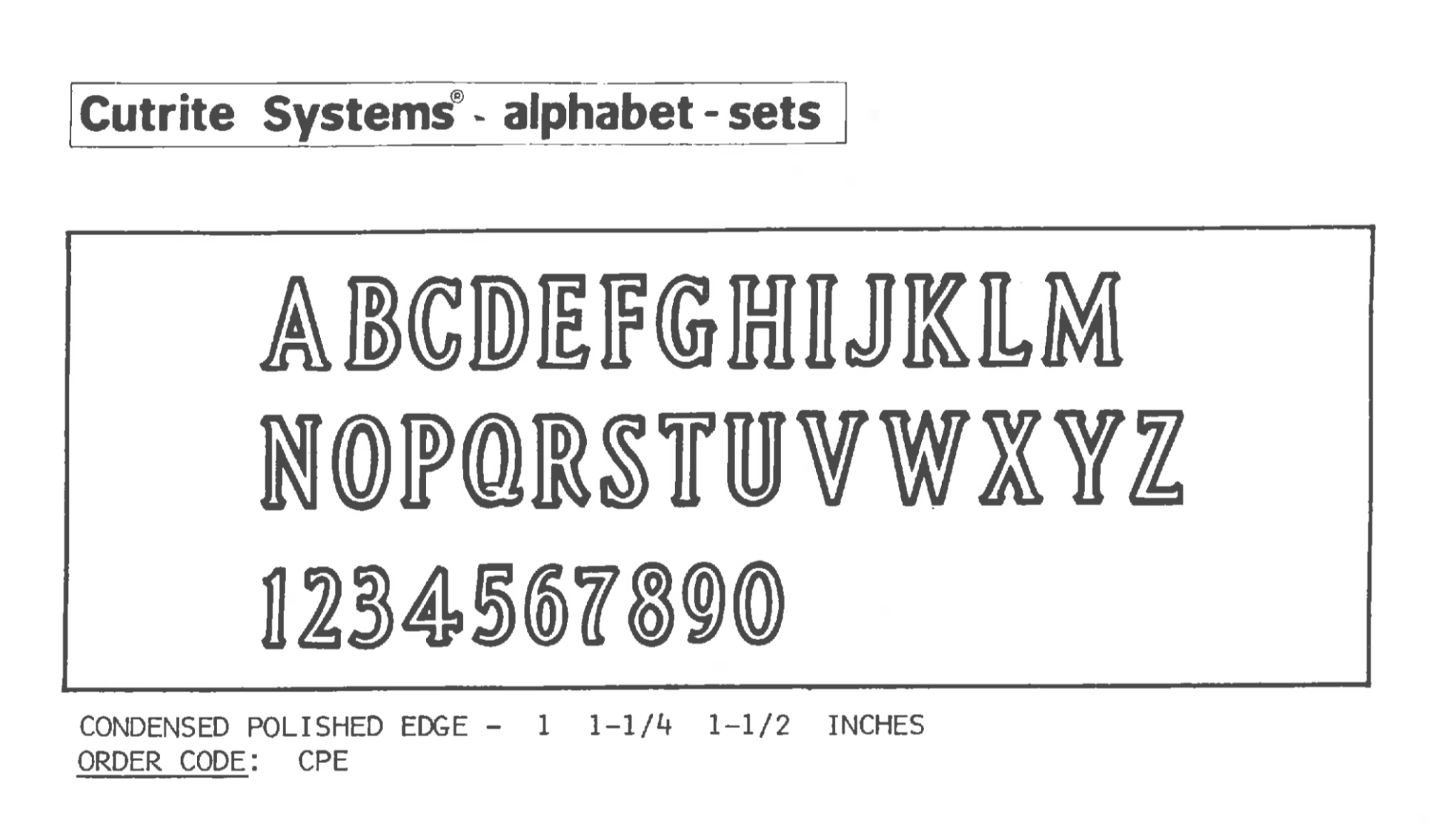
MLCKeymasterHello Brian, yes, this is a very rare plastic stencil press alphabet called Condensed Polished Edge, by a company called PMD for their Cutrite line. I am unaware of any digital versions available. I have several requests for an MLC version but have yet to come across a set of the plastic letters. Attached is an image from the Cutrite Catalog.
 MLCKeymaster
This is likely hand-drawn, but a similar digital font might be Copperplate Bold Condensed: https://www.myfonts.com/fonts/urw/copperplate/t-bold-condensed/
MLCKeymasterGiven the date (1989) and color of the stone, this is likely custom lettering by Coldspring Granite and drawn by hand. The lettering at the bottom has been digitized and is called “Runestone”, which is a Coldspring font, but the MLC is not aware of a font that matches what is used on the names and dates. The style of numeral 7 shown here, with the slight curve inward at the baseline is very rare to see in digital typography but was used commonly by English stone carvers. It does show up, however, in the commercial fonts “Perpetua” (in the old style numerals) and “English Engraver’s Roman”. It is also seen in a handful of North American memorial industry fonts which were based on English lettering styles, but none of them match what you have here.
MLCKeymasterHello, this font is called Ballentines Regular: https://www.myfonts.com/fonts/ef/ballantines-script/
June 13, 2021 at 7:13 pm in reply to: What is the name of this font? Look at Cap. A and small e and t #4100MLCKeymasterHello Torrey, this is a font called ITC Benguiat: https://www.myfonts.com/fonts/itc/benguiat/
MLCKeymasterHi Brian, not sure exactly what this is, but it looks like it may have either been done by hand, or perhaps it is a digital font like Helvetica that has been modified to match older lettering. If I take my version of Helvetica Neue Bold, manually condense it, move the crossbar down on the ‘A’s, and remove the strokes on the ‘1’ I get something very close.
June 8, 2021 at 11:35 pm in reply to: The only info I have for this is Lakehead? Any ideas where I could find this fon #4083MLCKeymasterHi Brian, yes, “Lakehead” and “Fancy Gothic” are both Monu-Cad fonts based on old plastic stencil press alphabets. There aren’t many digital versions of the fonts available. The original alphabet was called Modified Roman Raised, by the PALL Corporation. The second alphabet was based on PALL’s, but produced by the PMD Company for their “Cutrite” brand of stencil press alphabets. The biggest difference between the two was the punctuation. I have created a font for the MLC based on the PMD version, but it was wildly different punctuation than the one in your photo, which I do believe is Monu-Cad’s Lakehead. I am not aware of any other digital versions of the fonts available.
Here is a link to the closest font available in the MLC’s library: https://www.monumentletteringcenter.com/product/mlc-cutrite-modified-roman-raised/
MLCKeymasterThis is a font called Commercial Script. There are many different versions of the font, including some that have been modified for monument and sign-making software, but any version will get you close to what is on this memorial.
MLCKeymasterYes, this is a font called Melior Bold: https://www.myfonts.com/fonts/linotype/melior/pro-bold/
MLCKeymasterThis appears to be Helvetica Bold Condensed, or perhaps Black Condensed: https://www.myfonts.com/fonts/linotype/helvetica/pro-bold-condensed/
It is possible this a version specific to a monument or sign-making software that may contain subtle differences.
-
AuthorPosts