
MLC

Forum Replies Created
-
AuthorPosts
-
 MLCKeymaster
Unfortunately, this is an unknown version of Modified Roman but is possibly based on the Spacerite Modified Roman alphabet and modified to be bolder. It looks like it is possibly digital, as the dates appear to have been manually condensed. It is not a standard font available in any known memorial design software.
MLCKeymasterHello, after several years I finally have an answer for you. The font is called Grassby Roman. For more information see this recent post here: https://www.monumentletteringcenter.com/forums/topic/please-help-font-id-needed/
MLCKeymasterHello, after asking around and doing a little research, I’ve found that this is a custom font created by Andy Benedek of Font Factory in 2005 for Grassby Memorials in Dorchester. The font is called Grassby Roman. Grassby also has a custom block style font as well: https://www.grassby-stone.co.uk/public/files/grassby_lettering_styles.pdf
ScanCAD also sells a TTF version of the Roman font here: http://scancad.co.uk/page6.html
MLCKeymasterHello, this font is called De Vinne, or De Vinne Ornamental.
MLCKeymasterHi Torrey, the font is called University Roman.
MLCKeymasterGood morning, unfortunately, I’m unaware of the name of this font, but I don’t think this is something commercially available as a TTF or OTF font. I believe it is either hand-drawn or a proprietary script font in some German or Scandinavian memorial design software – I’ve seen similar font styles in the software available in these countries.
MLCKeymasterGood news, the MLC Signature Series Elbreco font has been completed and is available in the font shop: https://www.monumentletteringcenter.com/product/mlc-signature-series-elbreco/
MLCKeymasterHi John, this is Times Regular, not Times New Roman. The ‘S’ on New Roman won’t match.
MLCKeymasterHello Jill, I have run into this outlined version of Zapf Chancery before, but I believe it is either a custom version or possibly one available in some monument software I am not aware of. I have checked it against Monu-Cad, Gerber, Cochran’s, Flexi, Craftech, DesignMart, The Drafting Shoppe, Creative Premier, CGX, and SignLab with no luck.
MLCKeymasterHi John, this is the SKS Double Outline plastic stencil press alphabets in the largest sizes (2″-3.5″), or it is a possibly a digital version in some memorial design software. Cochrans for instance has versions of it available. The punctuation has either been hand-cut or it was not drawn up directly from the plastic alphabet.
The MLC has a version of the font available in the font shop: MLC ScotchKut Double Outline – Medium-Large
-
This reply was modified 4 years, 5 months ago by MLC.
MLCKeymasterSorry John, other than the versions mentioned in Monu-Cad and Gerber there are no known purchasable fonts. I do have the rubbings of the stencil press alphabet if you’d like help matching the inscription, feel free to utilize the MLC matching service: https://www.monumentletteringcenter.com/product/cemetery-inscription-matching-service/
MLCKeymasterHello John, this is Monu-Cad’s version of an old plastic stencil press alphabet. The capital ‘A’ and ‘L’ are from Monu-Cad’s “Roman Italic Medium”, while the lowercase is from their version of the font named “Stylish Sandblast 1”. There is also a version of it in Gerber named “Sandblast I ACCT. A.K. REV.B”, though Gerber does not have a version of Monu-Cad’s “Roman Italic Medium”.
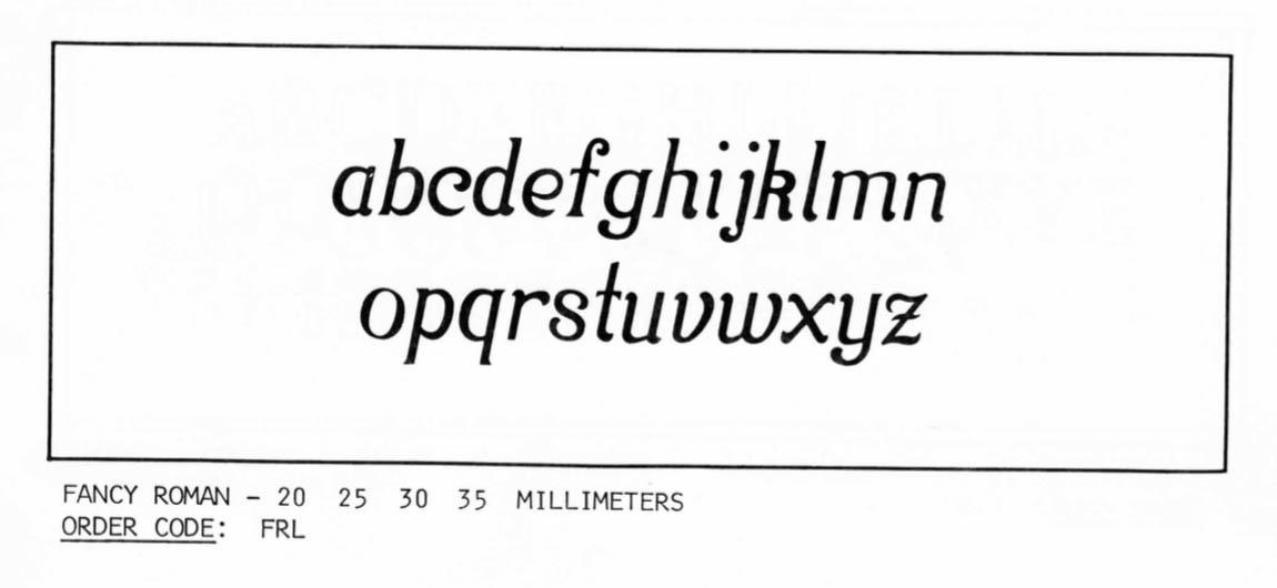
The stencil press alphabet was listed in the PMD Cutrite catalog as “Fancy Roman”, though it is believed to have originally been a Gaspari/PALL Corporation alphabet. However, as of yet a PALL catalog image has not been found. Below is an image of the lowercase from PMD’s catalog. There was also an uppercase and a set of numerals.
-
This reply was modified 4 years, 5 months ago by MLC.
MLCKeymasterThe font used for the original engraving is Caxton. Unfortunately, it appears someone tried to match it using URW Garamond Extra Bold Wide for Paul’s name, and Garth Graphic Black for his dates, while attempting to modify the ‘2’, ‘9’, and ‘0’ in order to match the existing numbers.
MLCKeymasterHello, this is a version of Goudy Regular Italic.
MLCKeymasterGood morning, this is a chancery style font called Lucida Calligraphy. Some older versions of the font have serifs on the ‘2’, ‘3’, ‘6’, and ‘9’; but it is difficult to tell from the size of the image if it is present on this memorial.
https://www.myfonts.com/collections/lucida-calligraphy-font-monotype-imaging
-
This reply was modified 4 years, 5 months ago by
-
AuthorPosts