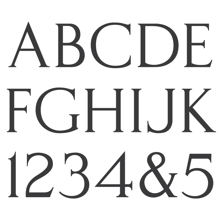
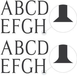
Description
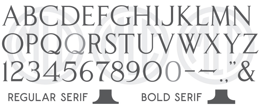
* Only the basic character set is shown here. For a sample character map see the MLC Font Project page. Alternate characters shown in grey.
Classification
Monument Roman: Classic
Usage
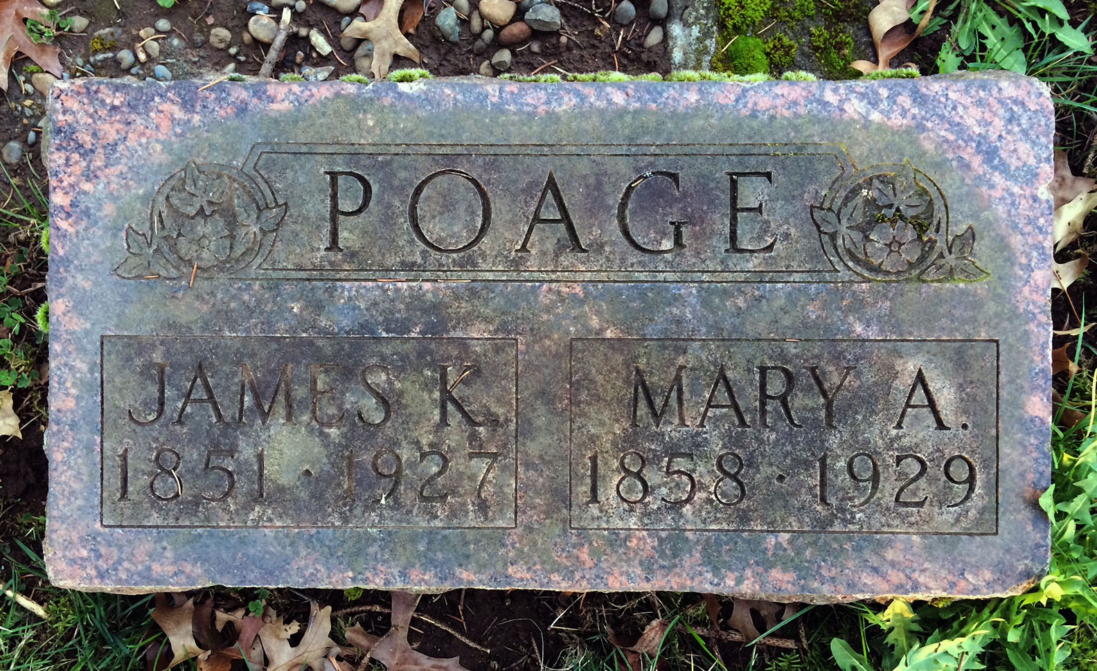
Created for the monument industry primarily for sandblast work, this alphabet has primarily been used for surnames on monuments, specifically over the top of family arches or columbaria, though it does also receive some usage for given names and dates on smaller memorials. The alphabet saw most of its use from 1925 until the 1960s, moderate usage through the 1990s, and some manufacturers still use Spacerite letter sets today.
Designer
The designer has not been confirmed, but it is likely that the letters were drawn by memorial draftsman Timothy Jellow, one of the two original partners of the Spacerite Company, and the original patent holder for the Spacerite system.
History
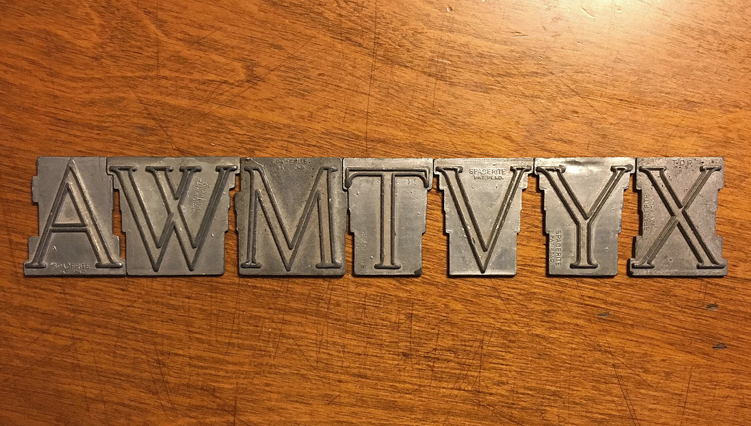
The Spacerite Classic Roman alphabet was the first monument font created by the Spacerite Company. This is confirmed by the first advertisements produced in 1925, which show only the Classic Roman letters on a Spacerite board. The alphabet was followed closely by the Spacerite Modified Roman, and both were created before the Spacerite patents were granted in 1926 – as many sets have the raised abbreviations “PAT. PEND.” on them. After the patent for the metal letters was received the words were removed from subsequent letter sets. The Classic Roman style of lettering was quite common in the industry at the time of the creation of the Spacerite sets, but the Modified Roman quickly took over in popularity.
Distinguishing Features
The Spacerite Classic Roman is not a traditionally defined Classic Roman, but has the basic Roman letter geometry, which has been the common identifier for the style in and outside of the monument industry for over a century. The alphabet is more properly categorized as a Modified Classic Roman, or Renaissance inspired Roman alphabet. The crossbars of the letters are not centered as they would have been in a historic Roman alphabet, but moved up or down slightly to give better visual balance; the round letters contain no stress (a counter-clockwise tilt of the letter), and the alphabet includes characters and modern numerals that were not a part of the Roman alphabet. Like most later Spacerite Roman alphabets, the serifs are much thinner than most Monument Roman fonts designed by other companies, though they are often thickened by the stencil cutter. The tail of ‘Q’ does not connect to the left side of the bowl on the actual metal letter, but is very close and would sometimes be connected. Many letters in the set are the same as the Modified Roman sets, including ‘E’, ‘F’, ‘S’, ‘I’ and ‘L’; all other letters are wider to varying degrees, and many contain different features. The stems of ‘M’ are slanted inward slightly, and the leg of ‘K’ connects to its stem instead of the arm. The Classic Roman shares the same numerals as the Spacerite Modified Roman except for zero, which is slightly more oval and contains softer curves.
Characters
The original alphabet contained no punctuation, but the company did eventually produce multiple dash lengths which could be used for any Roman alphabet. Also later produced was an ampersand, though it is very rare to see. An alternate ampersand is included in the font, which was created by flipping the ‘3’ vertically and adding a longer lower finial, typical of many later monument alphabets. All other punctuation and extra characters have been created by using other monument industry Roman alphabets as a guide. The MLC has included a second ‘Q’ and zero, available as OpenType alternates when using software which supports OpenType features. For ‘Q’, an alternate which connects the tail to the inside of the bowl is provided, which was sometimes connected by the stencil cutter. The modified roman zero has also been included, as it was common for manufacturers to use the Modified Roman numerals and pair them with the Classic Roman alphabet.
Update (07/27/2019) – A second “bold” weight with twice the serif thickness has been added. It was common for stencil cutters to thicken the serifs, especially on smaller lettering. If you have previously purchased the font please log in and download the update. It is recommended that you remove and re-install the original version as well, as changes were also made to the style naming of that font.

