Description

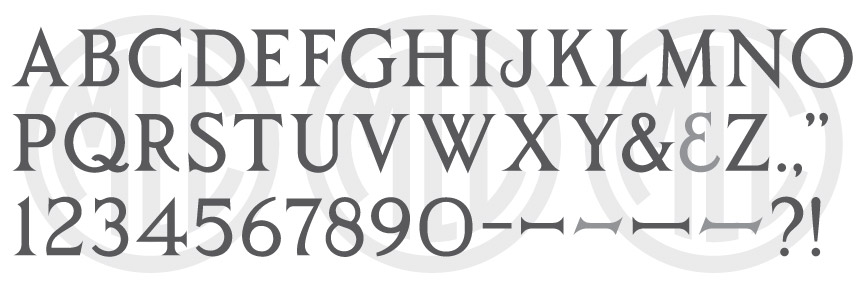
* Only the basic character set is shown here. For a sample character map see the MLC Font Project page. Alternate characters shown in grey.
Classification
Classic Roman
Usage
A somewhat stylized “Classic Roman”, the SKS Classic Roman did not receive widespread usage, though, the alphabet was eventually digitized in Cochran’s Monumental Designer software under the name “Modern Classic Roman”.
History
The SKS Classic Roman was not part of the company’s original offering in 1968, but was added to it’s alphabet selection by the time their “blue binder” catalog came out in 1973, after the purchase of PALL Canada’s Stencil Cutting Division. The exact date of creation and designer are unknown.
Distinguishing Features
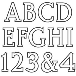
The SKS Classic Roman is often confused with the SKS Modern Roman alphabet, which contains somewhat similar letterforms and shares the same style of sharp, pointed serifs–though the letters ‘R’, and ‘J’ are entirely different, as well as the numerals. The serifs on the bottom of the letter ‘C’ are unique and uncommon, which would typically end in a finial. ‘J’ circles upward quite dramatically and bends back towards the stem of the letter, and ‘R’ has a more circular leg than is often used. The zero is quite a bit thinner than the other circular characters, and contains an actual vertical line on the inside curves at each side, rather than a smooth curve.
Characters
The punctuation was a bit sparse for the alphabet, and included a period, comma, and parenthesis. It did not include an ampersand or any dashes. The MLC has designed all remaining punctuation, including a second ampersand, which is available as an OpenType alternate in software that supports OpenType features.


