Description
* Only the basic character set is shown here. For a sample character map see the MLC Font Project page. Alternate characters shown in grey.
Classification
Classic Roman
Usage & History
Versions of the SKS Modern Roman received somewhat widespread usage as a plastic stencil press alphabet in both North America and across Europe. There are at least two variations of the alphabet by multiple stencil press companies. Scheibenbogen, a German stencil press company created a version of the alphabet which is believed to have been named “Elite Roman” and contained some differences to the ‘J’ and ‘W’, along with some subtle variations to the numerals. It is uncertain which version came first, or if another even earlier version predates the other two. The SKS alphabet was eventually digitized in the Monu-Cad software under the name “Bailey 1”, and while the numerals are the same weight as the original, the letters are quite a bit thinner. The Scheibenbogen version was digitized for Comcut by Schubert Software, under the name “NR-10”.
Designer
The date of creation and designer are unknown, but it was created by 1973.
Distinguishing Features
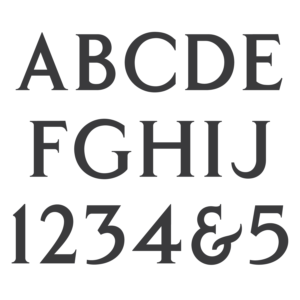
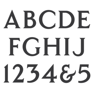
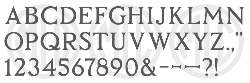
The SKS Roman Roman is often confused with the SKS Classic Roman alphabet, which contains somewhat similar characters and shares the same style of pointed serifs–though the letters ‘R’, ‘J’, and ‘W’ are entirely different, as well as the numerals. ‘J’ has a ball terminal, which is uncommon for memorial industry fonts, and also differs from the Scheibenbogen version, which ends flat and horizontal. The top bar of ‘E’ is actually slightly longer than the bottom, which is a very uncommon feature in typography due to its unbalanced feel. ‘M’ has a unique shape, which is hard to describe but is nonetheless distinctive and memorable. Unlike the rest of the characters, ‘3’ has almost no true serifs, and unlike most industry alphabets, ‘6’ and ‘9’ end in a more-or-less straight finial rather than curving back in towards the center of the characters.
Characters
The punctuation included with the alphabet was a period, comma, apostrophe, parenthesis, dash, and ampersand. The MLC has designed all remaining punctuation.