Description
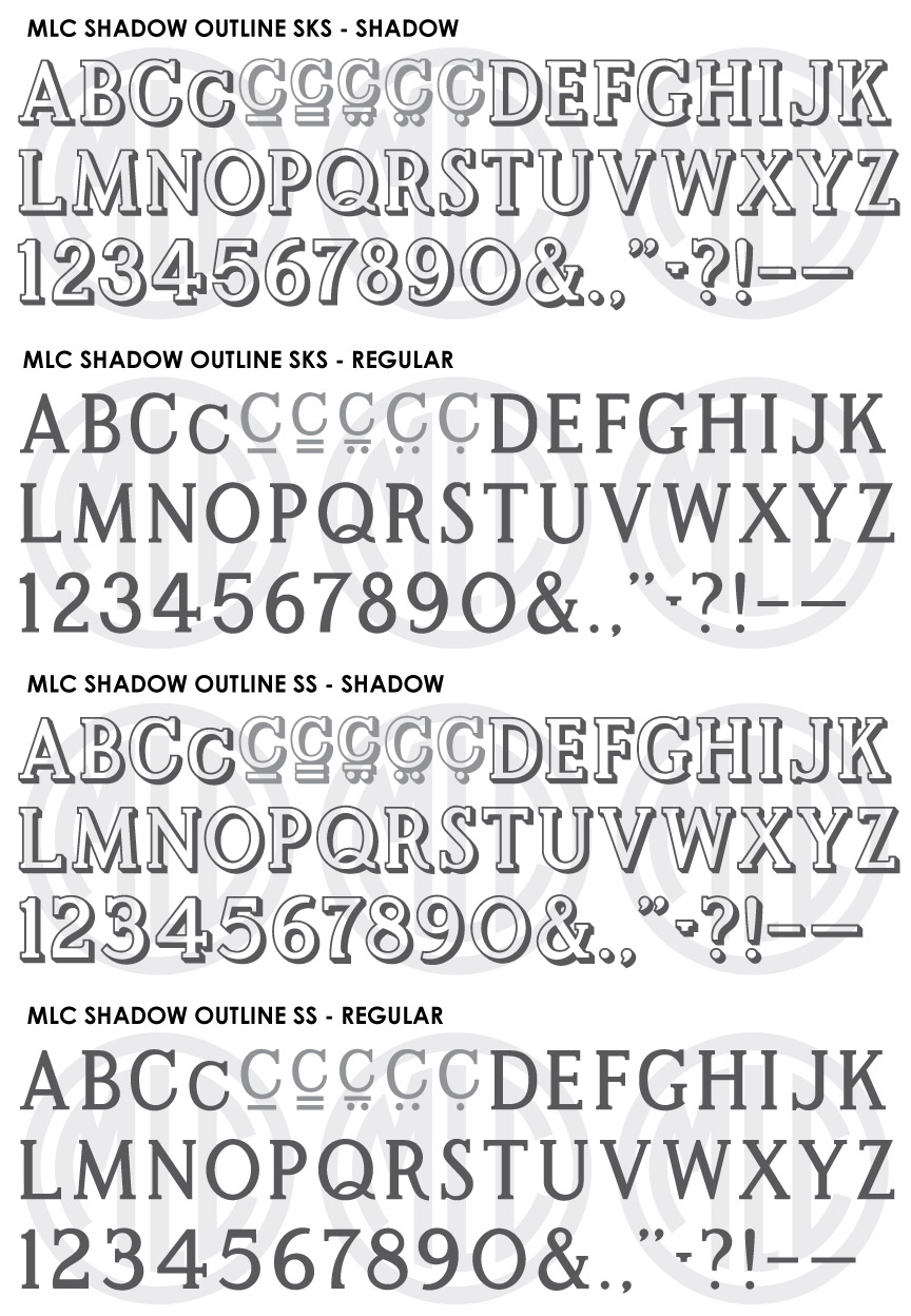
* Only the basic character set is shown here. For a sample character map see the MLC Font Project page. Alternate characters shown in grey.
Classification
Monument Roman: Outlined, Decorative/Surname
History & Designer
The ScotchKut Shadow Outline alphabet was not a part of the initial 1968 offering but was created in the early 1970s for the company by an unknown designer. The alphabet was designed to be used almost exclusively as a surname alphabet, being made in only 4 sizes (2″, 2.5″, 3″, and 3.5″), and containing no numbers. It was not the first alphabet designed by the industry with a drop shadow, as in Dakota Granite had previously designed a sans-serif shadow alphabet used for surnames sometime in the 1950s. The ScotchKut Shadow Outline alphabet received moderate usage and, though rare, has been seen used without the shadow as an incised bold Roman alphabet, and sometimes with an outline. It was later digitized by several memorial design software companies, including Craftech, Gerber (renamed “Monument Shadow”), and Cochran’s (renamed “Shadow Edge”). In the Gerber version, very awkward and unconventional numbers were added to the alphabet, mostly sans serif and appearing more like stock car racing numbers than numbers for a Modified Roman alphabet. These numbers have been subsequently added to some other digital versions so the style of numbers have been kept by the Monument Lettering Center in the SKS version, though they have been updated with several of the more egregious errors in design being somewhat smoothed out and fixed. The MLC has also created a second SS (MLC Signature Series) version of the alphabet containing many small changes as well as new numbers that match the original style of the alphabet.
Distinguishing Features
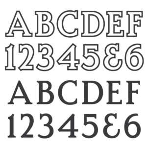
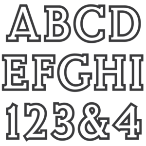
The feature that clearly sets the alphabet apart from other Modified Romans is that it contains a drop shadow. The shadow itself contains many inconsistencies, including varying thickness and areas that should have a drop shadow but do not—the “shadow” really being a mix of a drop shadow and a 3D extrusion effect, or “blocking” in sign painting. The leg of ‘R’ is quite straight until the final curve near the bottom, which is more obvious when the alphabet is used with no shadow or outline. ‘G’ contains a spur below the vertical stroke, similar to many other Bold Roman alphabets. The shadow and outline are inconsistent, most notably on the top left serifs where the shadow is missing, and the bottom right serifs where the outline is missing, leaving only a shadow as it would appear without an outline around the letter. In the MLC’s “SS” version, these issues have been fixed, giving a consistent outline and shadow, along with the new appropriately matching numerals. The SS version is recommended when designing new memorials, while the original version is best used to match existing inscriptions.
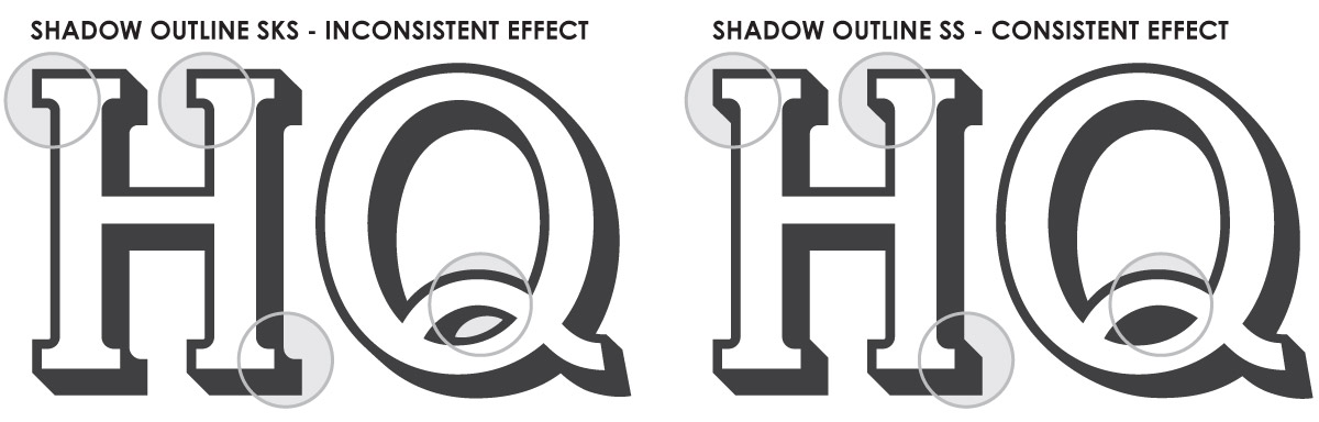
Detail of MLC Shadow Outline SKS and SS font differences.
Characters
The SKS Shadow Outline sets contain very little punctuation, including only a period and apostrophe, with no numbers. The MLC added full punctuation, and, as previously mentioned created two versions containing two different sets of numerals. As with most Modified Roman alphabets, it contained no lowercase characters, but the MLC did create a lowercase ‘c’ to be used with Gaelic surnames. All other lowercase letters in the fonts are identical to the uppercase letters. No alternate characters were included in the original alphabet, but as with all MLC fonts, there are several versions of lowercase ‘c’ and some other alternates added for punctuation. These characters have been included as OpenType alternates when using software that supports OpenType features.