Description
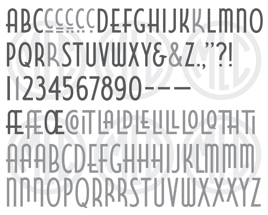
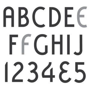
* Only the basic character set is shown here. For a sample character map see the MLC Font Project page. Alternate characters and ligatures shown in grey.
Classification
Sans-Serif, Art Deco
History & Designer
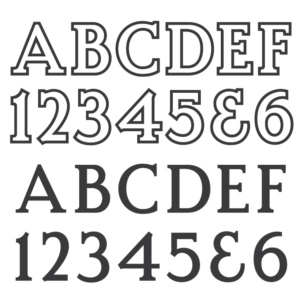
The designer and date of creation are unknown, but by at least 1958 it had been manufactured as a metal alphabet by the Spacerite Company and was used regularly by the AICA member Lloyd Brothers Company of Toledo, Ohio. The alphabet was never published in any Spacerite catalogs, and it is believed by the MLC that it was a custom alphabet created by Lloyd Brothers, as it first began appearing in trade magazine images of memorials which were produced by the Lloyd Brothers Company. In this case, the likely designer of the alphabet is Harold Francis Willhauck, who was the company’s designer from 1926 until at least 1977. The name is a bit of a mystery, but it is possibly a play on the Llyod Brother’s name, as a nod to the naming of the Vermarco alphabet, for which it bears a clear resemblance—the name being a shortened version of VERmont MARble COmpany. In this theory, the MCL believes the ‘EL’ may be a phonetic take on the double ‘L’ in Lloyd, followed by the ‘BR’ from Brothers, and the ‘CO’ from Company, or perhaps the ‘ECO’ is from the word Deco; (EL)oyd BRothers DECO. It may be a bit of a stretch, but no other explanation for the name has been found. The alphabet has seen limited usage since its introduction into the monument industry–mainly among AICA members. Some members created their own digital versions, along with a variation named “Westminster” which is the same basic font but with several changes made; most notably giving the oval letters straight “racetrack” sides, and removing the crossbar overshoot on ‘A’. The alphabet bears some resemblance to lettering used on Rock of Ages design prints during the 1940s, 50s, and 60s, and Rock of Ages did create their own very similar alphabet named “Newminster”. The MLC has also been made aware that the Rock of Ages software RockCAD also has a version of Elbreco included, under the name “El Breco”.
Distinguishing Features
Though it resembles Vermarco due to their shared Art Deco influence, from a design standpoint the Elbreco alphabet is far superior, having a more consistent framework and beautiful letterforms. Standing out immediately is the overhanging crossbar to the left of the letters ‘A’, ‘E’, ‘F’, and ‘H’. These crossbars also align with the crossbar of the letter ‘G’, giving many words a wonderful effect of the eyes being carried along by the partial line created by these letters. The letters are also quite narrow, giving the designer the ability to use much more text in small spaces than most fonts would allow.
Characters
It is not known if the Spacerite alphabet was designed with any punctuation, and therefore all punctuation and extra characters have been created by the MLC. The MLC used rubbings from the Spacerite letters to create the font, but also highly expanded the alphabet, creating many alternate characters for embellishing the surname, and adding several discretionary ligatures, which are available when using software that supports OpenType features.