MLC
Forum Replies Created
-
AuthorPosts
-
 MLCKeymaster
Yes, this is a version of Times New Roman only available in the Gerber Omega software. It is somewhat more condensed and slightly bolder than other versions of the font.
MLCKeymasterHello, yes, this is a memorial industry version of an old wood-type alphabet, created into a stencil press alphabet by the PALL Corporation under an unknown name. It was later made available by the PMD Company under their “Cutrite” line of plastic stencil press alphabets under the name “Fancy Roman”, and has been digitized in the Gerber software under the name “Sandblast I Acct. A.K. Rev. B”, but that is the only known digital version.
If you need help matching it for an inscription, feel free to use the MLC Inscription Matching Service.
 MLCKeymaster
Sorry for the delay Richard, this appears to be a version of Bold Modified Roman, but unfortunately I’m not sure which version. It is potentially a digital version of the SKS Raised Modified Roman, but the ‘A’ does not appear as wide as it should be, and the lower parts of the 3 and 9 appear too thin as well.
MLCKeymasterUnfortunately, this font eludes me. It contains some similarities to Della Robbia/Cantoria, but the ‘P’ and ‘R’ do not connect back into the vertical stroke on those fonts, and the ‘T’ also contains differences in the serifs on the horizontal stroke.
MLCKeymasterUnfortunately the print is too small so it is difficult to make out the small details needed to properly identify the font used here.
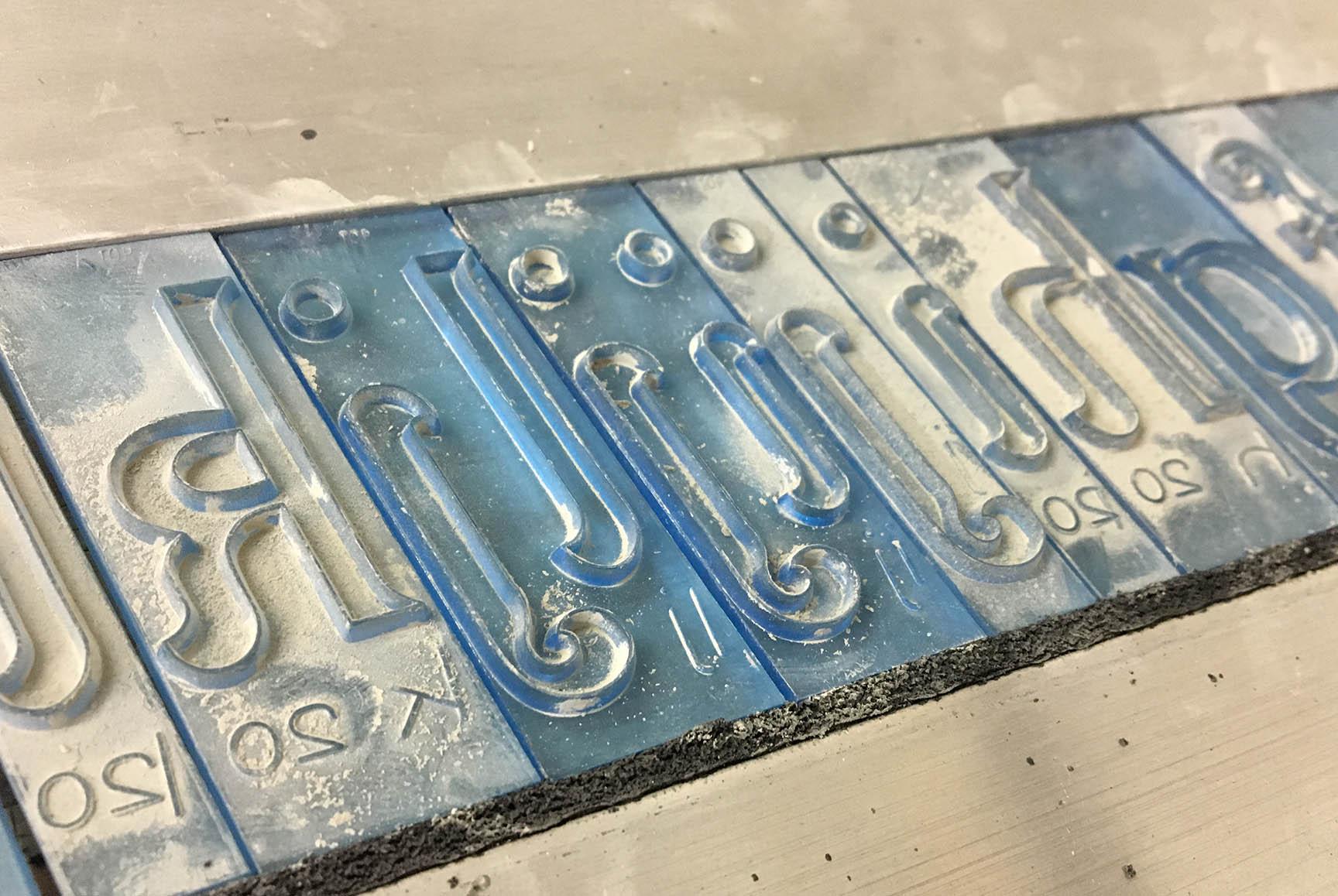
MLCKeymasterHello, this appears to be the ScotchKut (SKS) Modified Roman. It is possible it is a digital version, but does at least closely follow the original plastic letters. It contains the long thin serifs on the crossbar of the ‘T’, along with the notable feature of the bottom of the ‘W’ being very narrow compared to the top. The version of Modified Roman used for the epitaph at the bottom of the memorial also appears to be an SKS alphabet; the Raised Modified Roman. The MLC has digital versions of both of these alphabets:
MLCKeymasterIn all monument design software that I know if it is simply named “Hebrew”, or in Gerber which is primarily a sign-making software it is named “Monument Hebrew”. It does have nice crisp corners, so you are probably correct that an outline/stroke was added.
MLCKeymasterHello Buckley, this is a fairly common style of Hebrew used on memorials, but also very difficult to find the exact version used. It was first made as a metal Spacerite alphabet for transferring to stencil via rubbing paper and then made into plastic stencil press alphabets in the late 1960s by various companies. It has since been digitized and made available in I believe every memorial design software available. I also believe a number of monument shops ended up digitizing their own versions, so there are likely several dozen versions out there with slight difference. The style of Geresh and Gershayim (the marks appearing like our inch and feet notations in English) often vary quite a bit from version to version.
MLCKeymasterHi Darren, this is a font in Cochran’s Monumental Designer software simply called “Script”. The Drafting Shoppe has also created a version of the font for Gerber users named “Script European”.
MLCKeymasterHello, this appears to be a hand-drawn Modified Roman—though it is possible that the metal Spacerite Modified Roman alphabet was used as a base with the stencil cutter making some of the strokes thinner and the serifs thicker, but I am not aware of a digital version of the font that will match what you have here very closely.
If you’d like help matching this, feel free to use the MLC Inscription Matching Service: https://www.monumentletteringcenter.com/product/cemetery-inscription-matching-service/
MLCKeymasterHello, this is a very interesting lettering style. It’s a “Ball-serif” font, but I believe this is custom hand-drawn lettering and not a font—as those ball-serifs are much larger than anything I’ve seen before and this memorial was made before the computer era.
If you would like help matching it, please feel free to use the Inscription Matching Service: https://www.monumentletteringcenter.com/product/cemetery-inscription-matching-service/
MLCKeymasterAlternatively, if you’d like help matching this feel free to use the MLC Matching Service: https://www.monumentletteringcenter.com/product/cemetery-inscription-matching-service/
MLCKeymasterHi Darren, yes this looks like either the metal Spacerite Modified Roman letters were used for the layout and then the stencil was very roughly cut by hand, or this was possibly just a version of Modified Roman drawn entirely by hand. The MLC has a TTF version of “handcut” Modified Roman available which has these sharp serifs, but it would need to be further modified in order to match this inscription very closely: https://www.monumentletteringcenter.com/product/mlc-spacerite-modified-roman-handcut/
MLCKeymasterHi Darren, I believe this is a version of Times New Roman only available in the Gerber Omega system, named “Times New Roman-GSP ACCT AK Rev A”.
MLCKeymasterHello, this is a print industry font called Latin 725. There are also versions of it available from different font foundries under the names “Meridien”, and “Frutiger Serif” (named after the designer, Adrian Frutiger).
In Cochran’s software, there is a version simply named “Latin”.
-
AuthorPosts