MLC
Forum Replies Created
-
AuthorPosts
-
 MLCKeymaster
This is an old ITC font called One Stroke Script. It looks like it has been given a manual lean: https://www.myfonts.com/fonts/itc/one-stroke-script/
MLCKeymasterThis looks like a version of Baskerville Bold. Maybe ITC Baskerville Bold, or Bitsream’s Baskerville Bold. The dates appear to have been manually condensed/squeezed.
MLCKeymasterBoth of these appear to be hand-drawn lettering. Douville is especially nice work. These will need to be drawn up from scratch if you are needing to match them. Feel free to use the MLC Inscription Matching Service: https://www.monumentletteringcenter.com/product/cemetery-inscription-matching-service/
August 30, 2021 at 11:30 pm in reply to: Not sure. Lady said she thinks Cockrin font. Any idea? #4335MLCKeymasterYes, this looks like it could be Cochran’s Modified Roman. There are multiple versions of the font (that vary in boldness) in Cochran’s for use at different sizes. Unfortunately, Cochran’s fonts are in a proprietary format and there is no other version of Modified Roman available that will match it terribly closely at all sizes. It does generally follow similar letter geometry as the ScotcthKut Modified Roman.
MLCKeymasterSorry, I’m unsure of what version of Modified Roman this is. It is likely an obscure version created for a sign-making software that wanted to add some monument fonts, or created by a specific shop for internal use. Very crude drawings of the characters, similar to some of the monument fonts in CadLink SignLab, but I don’t see this in the SignLab font catalog.
MLCKeymasterThis appears to be the metal Spacerite Condensed Roman alphabet, which has been given angled serifs. This happens when the stencil cutter takes shortcuts on cutting the serifs, and is often referred to as “handcut”.
The MLC has a font to match the handcut letters: https://www.monumentletteringcenter.com/product/mlc-spacerite-condensed-roman-handcut/
Because the letters are cut by hand there will always be inconsistencies and sometimes the thickness will vary as well, but the letter geometry should be similar.
MLCKeymasterHello Willard, this appears to be a font called Imperial. Not terribly common. Here’s a link to where it can be purchased:
MLCKeymasterThere’s really not a lot to go off of here, but this is possibly Minion Medium Italic. Do you happen to have any more examples?
MLCKeymasterHello, I believe this is Helvetica Medium.
MLCKeymasterHello Kim, the font used for the surname is Victorian: https://www.myfonts.com/fonts/itc/victorian/
The font used for the name and dates is called Old English Sandblast in Monu-Cad, and Monument Gothic Regular in Flexi-Sign. It is based on hand lettering from the lettering section of the American Monument Association’s 1982 book Symbols: The Universal Language. There are currently no versions available for purchase in the standard font formats, but the MLC has plans to eventually create one.
If you would like help matching the name and dates, feel free to utilize the font matching service: https://www.monumentletteringcenter.com/product/cemetery-inscription-matching-service/
MLCKeymasterHello Kim, the Remco fonts were designed in-house but based on existing fonts. Remod is a bolder version of the AICA 25 font, for which there are currently no fonts available for purchase. Recen is a version of Century Old Style, and I’ve not seen anything like Europea before. It is doubtful, but possible it was an original creation.
The MLC will have a version of Remod/AICA-25 available soon.
MLCKeymasterThis is the version of Zapf Chancery Bold in the Gerber Omega Composer software, which has the non-lining figures used for the numerals. There may be other versions available with the non-lining figures included as an OpenType feature.
MLCKeymasterHello Eric, this is a font called Korinna Extra Bold: https://www.myfonts.com/fonts/itc/korinna
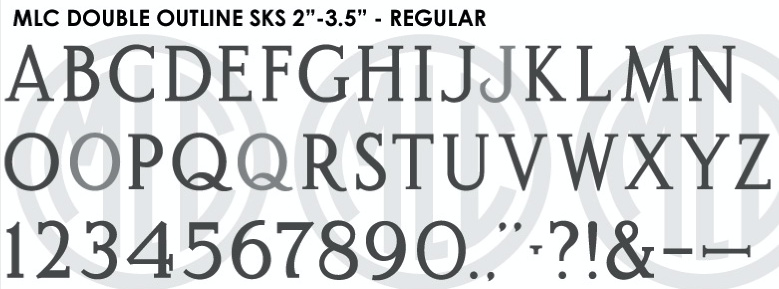
MLCKeymasterHello Toby, this is the inside lines only of the large sets of the ScotchKut Double Outline plastic stencil press alphabet. The MLC has a version of this font available in the shop: https://www.monumentletteringcenter.com/product/mlc-scotchkut-double-outline-medium-large/
-
This reply was modified 4 years, 5 months ago by MLC.
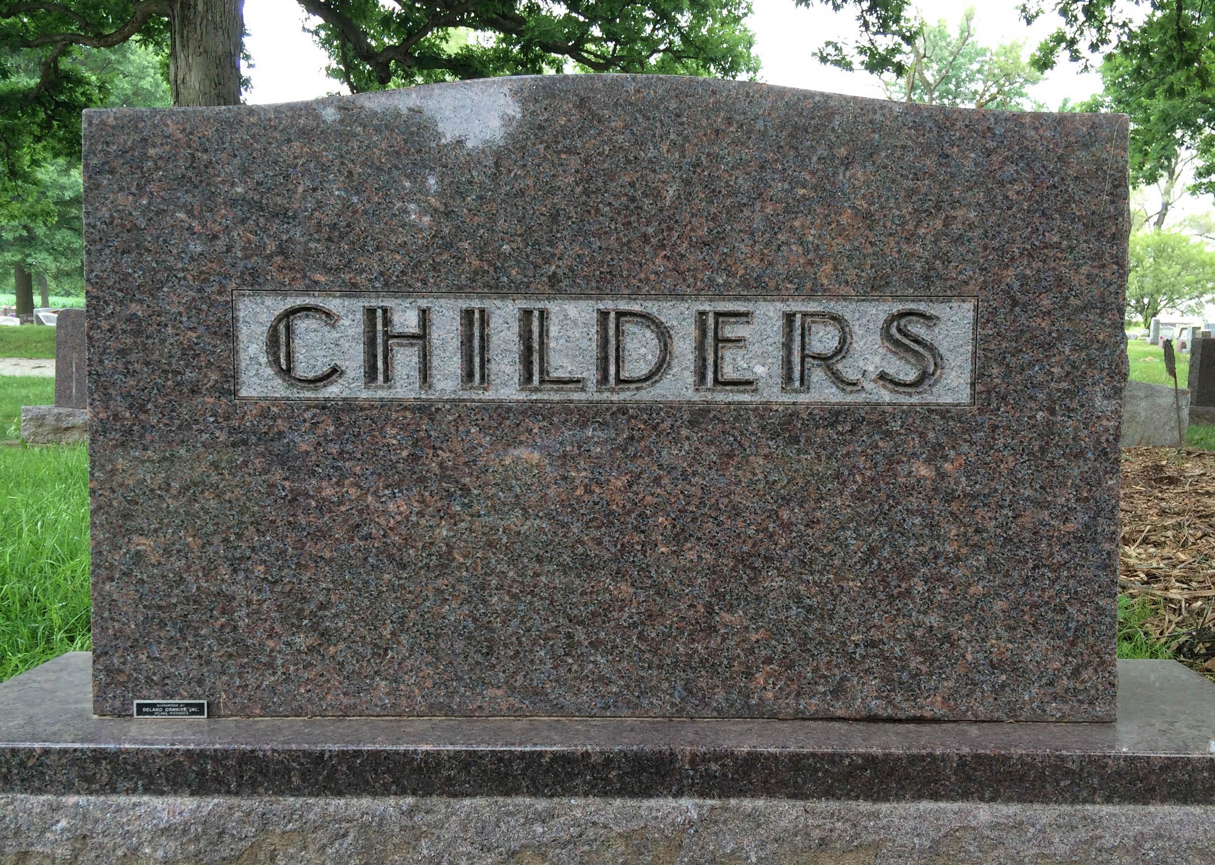
MLCKeymasterHi Corey, this is an old lettering style from the Delano Granite Works in Delano Minnesota, which later became Rembrandt Memorials and has since been closed down. They were at one time the largest memorial maker in the country, or so they claimed.
Their lead designer, C.E. Dunn, created several alphabets exclusive to the company that were made into metal, glass, and plastic alphabets. This style was often also used for raised polished letters as in the attached example.
Fortunately, I have a rubbing of one of the glass alphabets. If you would like help matching the lettering on this memorial, feel free to use the Inscription Matching Service: https://www.monumentletteringcenter.com/product/cemetery-inscription-matching-service/
-
This reply was modified 4 years, 5 months ago by
-
AuthorPosts