Description
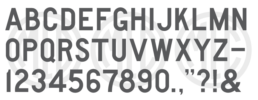
* Only the basic character set is shown here. For a sample character map see the MLC Font Project page.
Classification
Commercial/Common Gothic
Usage
Created as a plastic stencil press alphabet for cutting sandblast stencil, this alphabet saw most of its usage during the 1970s and 80s.
History & Designer
Designed in the early 1970s by Anthony Gaspari for the Allied Industrial Sales Corporation after Gaspari decided to leave the PALL corporation. The alphabet was later used as the starting point for the PMD Common Gothic alphabet, and will match very closely, if not exactly.
Distinguishing Features
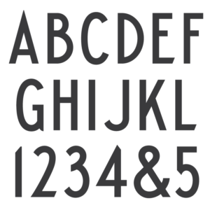
There are many noticeable differences between this version and other Common Gothic style memorial industry alphabets. Overall the alphabet has much less space between the letters (referred to as tracking in the print industry) as is usually given to these Common Gothic alphabets. The legs of ‘K’ and ‘R’, are on much shallower angles than is typical, shortening the width of the letters. ‘B’ has a much smaller top loop than usual, and ‘W’ slightly more thick than the rest of the letters. The ends of the curves of ‘C’, ‘G’, ‘J’, ‘S’, ‘2’, ‘3’, ‘6’ and ‘9’ are slightly shorter than the typical Common Gothic. The punctuation and ampersand are very different from the ScotchKut Common Gothic, having square punctuation instead of round, and the ampersand being much bolder. The numerals vary in height, especially ‘5’, which is much larger than the others, and is also much bolder at the top than at its base. The top circle of ‘8’ is much smaller, and the bottom much larger than usual, giving the two loops a greater contrast in size. ‘6’ and ‘9’ have very small loops, which give them a longer feel. ‘4’ has a much lower crossbar than other versions. The MLC slightly corrected the sizes of ‘5’ and the ampersand, as well as the thickness of ‘W’ to better match the rest of the letters–though they will still match the original letters enough for final dates.