Description
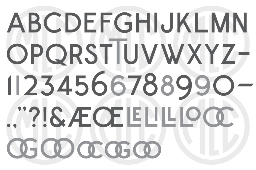
* Only the basic character set is shown here. For a sample character map see the MLC Font Project page. OpenType features shown in grey.
Classification
Common Gothic: Modified
Usage
This alphabet was created for hand carving. It is unclear if this style of lettering was ever actually widely used on memorials, or if it was simply a neglected attempt by the company to provide an alternative to the popular commercial or “common” gothic alphabet which was maligned by so many in the industry due to its lack of style. This font may be found useful today by both sandblast engravers, or modern letter carvers laying out designs prior to hand carving, and is especially suited for engaged lettering.
History & Designer
This alphabet was created by the Vermont Marble Company and released in its 1923 booklet Lettering in Marble. The author of the booklet likely designed each of the alphabets included, but is unfortunately not credited.
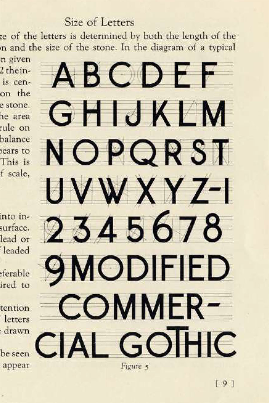
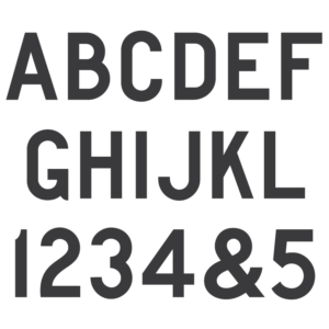
Historic Modified Commercial Gothic lettering for marble headstone carving.
Geometry
The modified commercial gothic alphabet is based on a 60 degree and 45 degree angle construction, using a classic roman type letter geometry.
Distinguishing Features
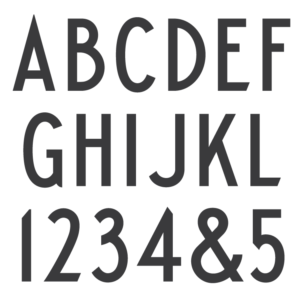
This geometric sans serif alphabet has circular curves, unlike standard commercial gothic styles. Numerals ‘6’ and ‘8’ extend above the cap-height, and numeral ‘9’ extends below the baseline.
Characters
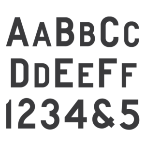
The alphabet was printed with no punctuation except for a dash, and as such, all extra punctuation and characters have been created by by the MLC. The booklet also shows an alternate capital ‘T’ which extends far above the cap-height, and has been included in the font. The MLC replaced the numeral ‘1’ of the original design with a a notched ‘1’, but kept the original as an alternate; and also added several other alternates and ligatures including versions of ‘6’, ‘8’ and ‘9’ that do not extend past the cap-height baseline. These characters are available as OpenType alternates when using software which supports OpenType features.