Description
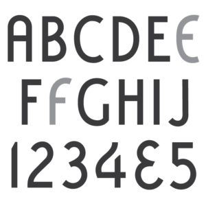
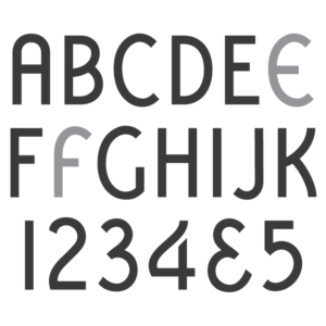
* Only the basic character set is shown here. For a sample character map see the MLC Font Project page. Alternate characters shown in grey.
Classification
Art Deco
History & Designer
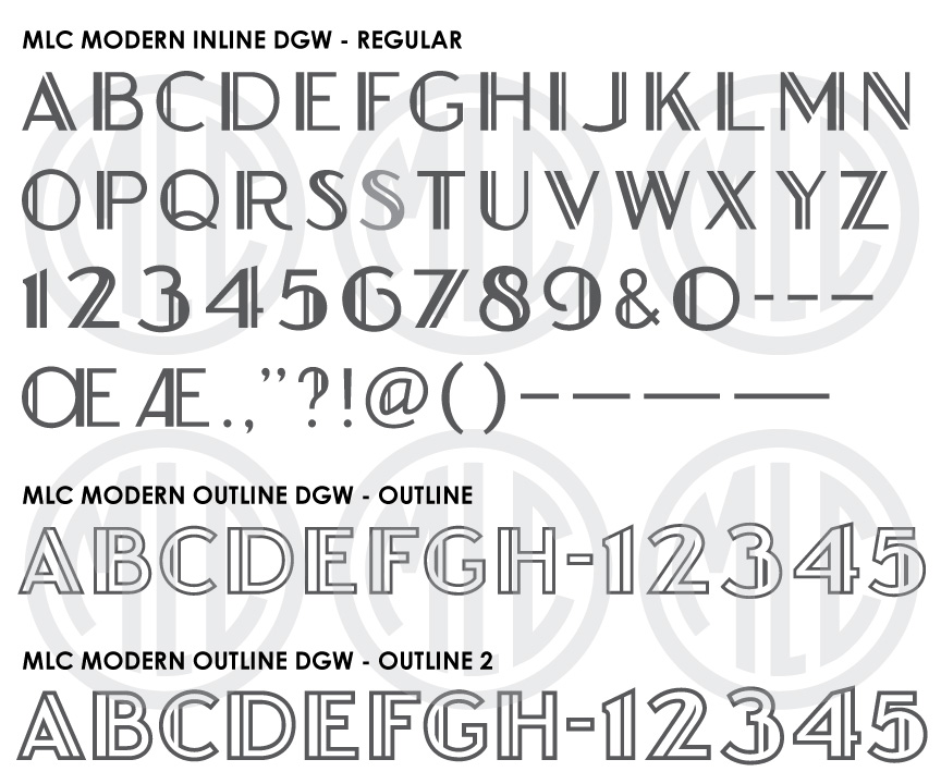
Delano Granite Works of Delano, Minnesota created this version of the “Modern” Inline font, a name used in the monument industry for many sans-serif art deco-inspired fonts. The alphabet was created in-house by the company, and was at some point sandblasted into glass plates for reproduction at several sizes–either by the Delano Granite Works or perhaps another local company or cemetery letterer. The likely designer of the alphabet was the company’s head designer CE Dunn, who created many lettering styles for the company between the 1940s and 1960s. Due to the fragile nature of the glass plates, only a few of them have survived. To create this version of the font, the Monument Lettering Center used rubbings of glass plates with letters at 1.25″, as well as a portion of a plate at 1.5″, and images/rubbings of larger letters on memorials in the cemetery. Because the letters were drawn by hand, it is possible that they varied at larger sizes which were not available to the MLC. The Monument Lettering Center has created 3 versions of the font, Regular (with no outline), Outline (will match the 1.25″-1.5″ letters), and Outline 2 (a bolder outline to match more closely to other versions seen in the cemetery). Monuments with the font used for the family name at much larger sizes have been seen in cemeteries, but no known lettering plates at these larger sizes still exist.
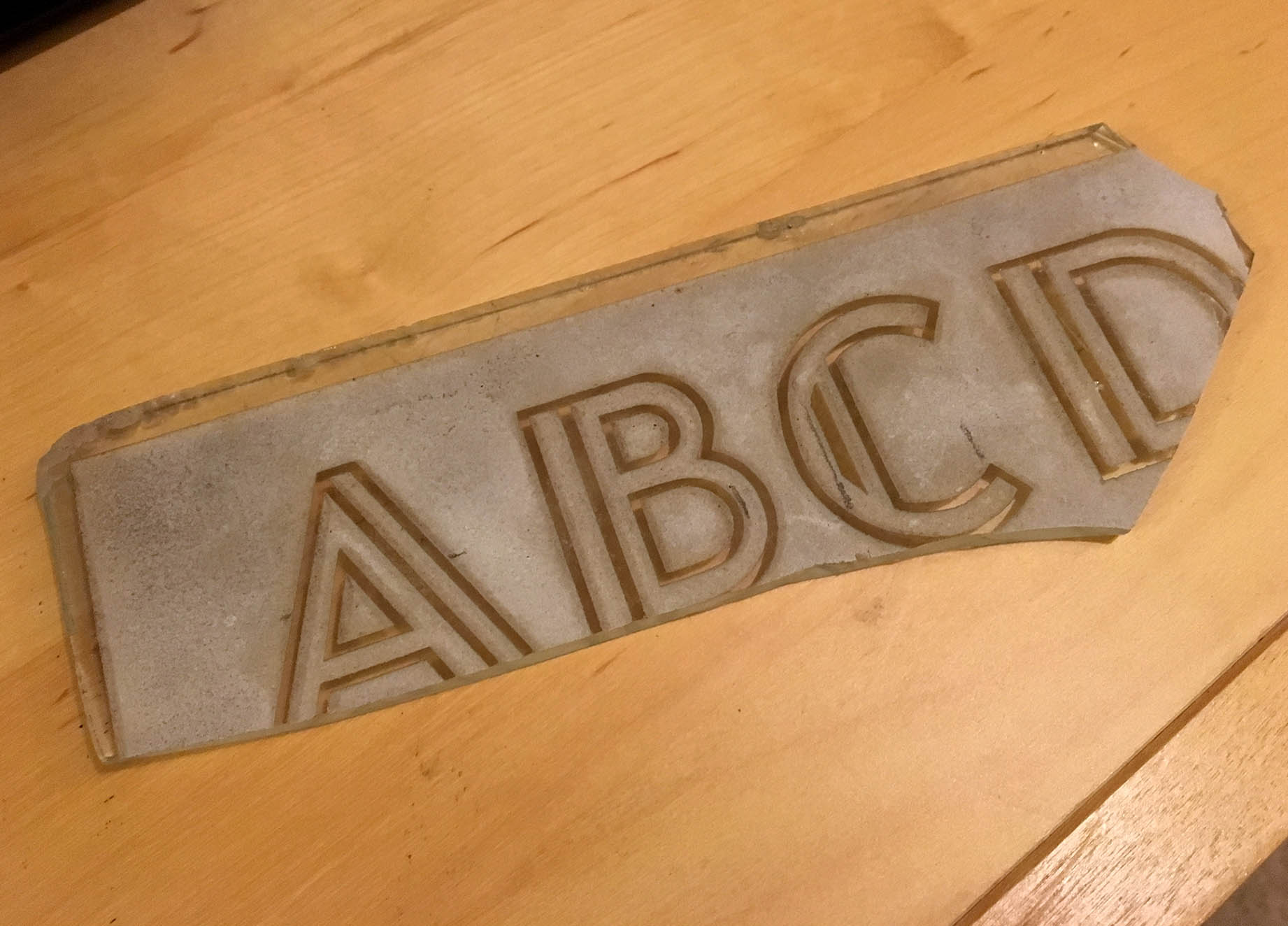
Portion of a glass Delano Granite Works Modern alphabet glass plate.
Distinguishing Features
The line splitting most letters into two sections, commonly referred to as an “inline”, is the predominate feature of the font. The bottom curve of ‘J’ meets the stem at sharp angles instead of a smooth curve like in the ‘U’. The leg of ‘R’ is a quite unique, nearly following the curvature of a circle as it extends away from the letter.
Characters
The glass plates used to create the MLC version of this font contained no punctuation. The MLC created all punctuation, as well as an alternate wider version of the letters ‘S’ to match what has been seen on larger sizes on cemetery memorials. Alternates are available in software that supports OpenType features.