Description
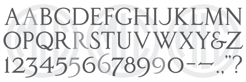
* Only the basic character set is shown here. For a sample character map see the MLC Font Project page. Alternate characters shown in grey.
Classification
Monument Roman: Classic
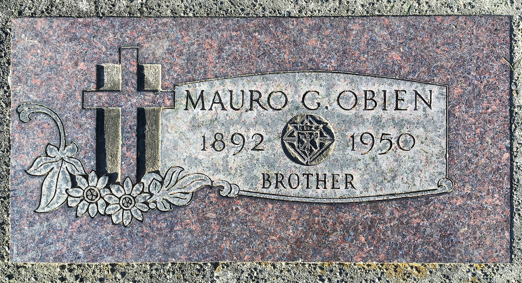
Floyd A. Holes Classic Roman used on a flat marker in 1950. Note the FAH Modified Roman used for the endearment under the Knights of Columbia emblem.
Usage
Created for tracing letters to be hand cut from sandblasting stencil, this alphabet saw most of its use beginning around 1940 and continued regularly through the 1960s, although it has been seen on stones created even in the 1970s and 80s.
History
Though the exact date of creation is unknown, this Classic Roman alphabet was likely first produced on brass lettering plates by the Floyd A. Holes Company in the late 1930s, and continued to be produced and marketed later on by the joint venture Holes & McClellan. The alphabet was released at different sizes on the H&M plates No. 4, 5, and 6.
Designer
The designer of this Classic Roman alphabet has not been entirely confirmed, but at least the numerals for the alphabet and the system of spacing were originally designed by Egon Weiss and printed in his lettering articles in the architectural magazine Pencil Points beginning in 1928, and later in his book The Design of Lettering in 1932. If he did not design this Classic Roman alphabet directly, the Roman alphabets Weiss designed and printed share enough features to assume they were at least used as references.
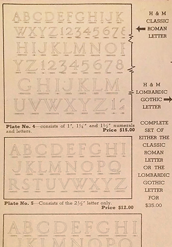
1940s sales advertisement for Classic Roman Holes and McClellan lettering plates.
Distinguishing Features
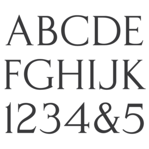
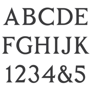
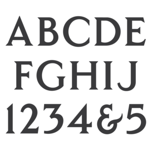
Slightly rounded corners. ‘A’ is notched, which is not actually a feature of Classic Roman alphabets, but stems from the renaissance. The leg of ‘R’ extends further than most, and ‘J’ has no serif at the end of the finial. The numerals of the alphabet are non-lining, and have fairly inconsistent sizing–none of them actually reaching the cap-height of the letters.
Characters
The plate contained no punctuation, and as such, all punctuation and extra characters have been created by the MLC. The ampersand previously designed by the MLC for the Floyd A. Holes Modified Roman font was used, but slightly widened to fit with the classic roman letter geometry. An Alternate version of the ampersand from an earlier version of the Modified Roman font created in 2009 has been included. A stylized alternate ‘R’ was also included to cooperate with the Floyd A. Holes Modified Roman where a stencil cutter chose to modify the bowl, ending the cut early instead of attaching it to the stem. An alternate ‘5’ was included which drops down to match the descender of ‘3’, and alternates for ‘6’ and ‘9’ were included to match each other. In November 2018 an alternate ‘A’ with a flat top was added to the font at the request of an MLC customer. These alternate characters are available as OpenType alternates when using software which supports OpenType features.