Description
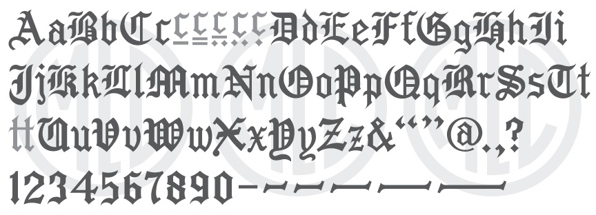
* Only the basic character set is shown here. For a sample character map see the MLC Font Project page. Alternate characters shown in grey.
Classification
Blackletter/Old English
Usage
Created for the monument industry to be used with a stencil press machine, this alphabet was meant to be punched out of stencil and sandblasted. Because of the decline in popularity of Gothic-style memorials by the second half of the 20th century, the alphabet did not ever see large-scale usage. A version of the alphabet was digitized in the monument design software, Monu-Cad, but this version appears to have been drawn from the Scotchkut catalog image and not the letters directly, as much of the detail was lost.
History
The ScotchKut Old English alphabet appears to be based on the earlier Spacerite Old English metal letter set, evidenced by the fact that almost all of the letters share the same design. The exact date of creation is unknown. The alphabet was not included in the original 1968 ScotchKut catalog, but it does appear in the 1973 SKS catalog.
Distinguishing Features
Similar to the Spacerite Old English alphabet, the form of the letters in this alphabet is of a typical traditional blackletter style, which can be seen in many vintage lettering books. However, the letters are much bolder than the Spacerite Old English, and the numerals are vastly different, following a typical blackletter style, similar to what is found in an Engravers Old English font. The only letters that do not share the same design as the Spacerite alphabet are ‘F’, ‘P’, ‘Z’, ‘v’, ‘w’, ‘x’ and ‘z’. Minor differences are found on ‘A’, ‘B’, ‘K’, ‘a’, ‘p’, ‘t’, and ‘y’. Among the differences, ‘Z’ and ‘z’ are the most noticeable, having only one diagonal instead of two as in the Spacerite set. ‘F’ has lost its vertical thin stroke, and instead has been given a similar crossbar to that of ‘E’. ‘P’ has been given a splayed serif at the base of the downstroke and had its thin vertical stroke shortened. ‘v’ and ‘w’ have been given more common shapes for those letterforms, and ‘x’ has been considerably widened.
Characters
The original plastic letters contained both upper and lowercase letters, numbers, and a fairly full set of punctuation–a rare occurrence for a stencil press alphabet. Included with the punctuation was an ampersand, comma, period, dash, and a set of parenthesis. The MLC added all other punctuation, as well as a ‘t-t’ ligature and multiple dash lengths. These ligatures have been included by the MLC as OpenType features when using software that supports them.