Description
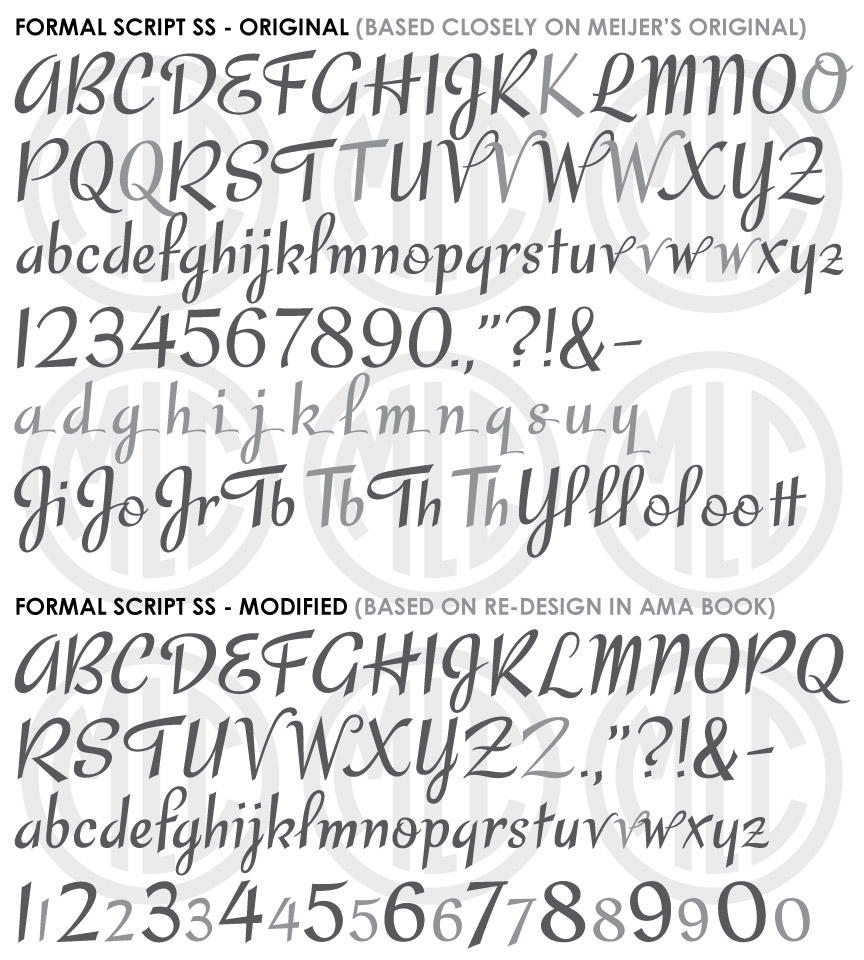
* Only the basic character set is shown here. For a sample character map see the MLC Font Project page. Alternate characters shown in grey.
Classification
Script
Usage
This alphabet has seen limited usage since its introduction into the monument industry in 1982 as a modified version of a script alphabet first printed in a book of script lettering alphabets, and was later digitized in various monument design software including Craftech, Monu-Cad, and Cochran’s systems; under the names “Script 2”, “Brush Script”, and “Behm Script”. The MLC has created a version to match the modified version, and one that retains more of the beauty and consistency of the original.
History & Designer
The alphabet was originally designed by Martin Meijer, a dutch lettering artist, and printed in his book 1956 book Script Lettering. A year later in 1957 a French lettering artist named J. Jovenaux copied the alphabet for his own book La Lettre Dans La Peinture Et La Publicité, which contained a less skilled version of the alphabet. A modified version made it’s way into the greater monument industry via the 1982 American Monument Association book Symbols: The Universal Language. The chapter on lettering was written and drawn by Mike Johns and Ricky Tichy of the Johns-Carabelli Co, a member of the AICA. The alphabet had previously been submitted to other AICA members as part of the AICA’s alphabet blueprint series.
Distinguishing Features
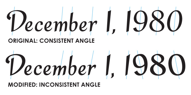
Though Meijer’s original description of his unnamed lettering style was “formal and upright”, the script is actually more of an informal, slightly playful alphabet. Unfortunately the modified alphabet printed in the AMA book did not carry over the skillful strokes of a professional lettering artist, and never received widespread usage inside the memorial industry, possibly due to the awkwardness of the letters (which appear to be drawn and not written like the original) and the inconsistency of their angle. This can be most clearly seen in the numbers (Meijer’s alphabet did not contain numbers), which do not share the angle and design of the letters–which should remain consistent throughout. Unfortunately, these issues removed the flow and beauty of the letters which allow for readability and unity of design. The MLC created a version for matching inscriptions where the modified alphabet was used, as well as a version based closely on the original for designing new monuments.
Characters
The alphabet was printed with no punctuation, and therefore all punctuation and extra characters have been created by the MLC. As there were no numbers designed by Meijer for his original alphabet–and the numbers in the AMA book are largely inconsistent with the letters–the MLC created numbers to match the original which are based on the design from a separate alphabet in Jouvenaux’s 1957 lettering book, which have a similar style and stroke. The MLC also created several alternate characters and standard ligatures, which are available when using software that supports OpenType features.