Description
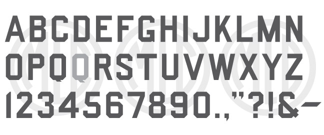
* Only the basic character set is shown here. For a sample character map see the MLC Font Project page. Alternate characters shown in grey.
Classification
Block/Square-Raised
Usage
Square Block styles of lettering were originally mainly used for raised letters in the memorial trade, and in fact, were sometimes simply referred to as “raised” in trade magazines. However, the Spacerite Splayed Corner Gothic can often be seen used in the cemetery both incised and raised. The style was popularized with the rise of granite in the late 1800s and continued to see common usage until the 1920s with the rise of sandblasting and the revival of the Classic Roman letter.
History
The Splayed Corner Gothic was modified from the Round Corner Gothic by the Spacerite Company. It shares almost the same letter shapes and geometry, but with all curves removed and clipped, or “splayed” corners. The alphabet was released sometime in the early 1950s, but no later than 1952, which is surprisingly late for this style of lettering.
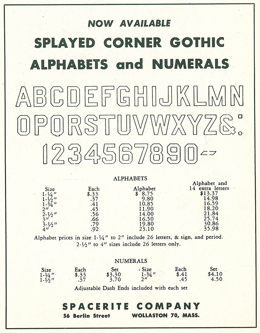
Spacerite Splayed Corner Gothic advertisement (Monumental News-Review, Mar 1953)
Designer
The designer of this alphabet is unknown.
Distinguishing Features
The most distinct feature of the alphabet is the rounded inside corners – the outside corners obviously being “splayed” (cut at 45º angles). Both features were commonplace in the industry at the time, but most later block or splayed gothic alphabets in the industry did not contain the rounded inner corners, having sharp 90º angles. Many monument makers did simply cut straight lines and remove this distinct rounding, so it cannot be relied upon to identify the alphabet in the cemetery.
Characters
The original alphabet contained some punctuation including a hyphen and an ampersand. All other punctuation has been created by the MLC. Two ‘Q’s have been included in the font, as the original metal ‘Q’ did not enclose the bottom of the tail, leaving room for the stencil cutter to extend it beyond what was possible for the physical plate. The second ‘Q’ may be accessed as an OpenType alternate in applications that support OpenType features.