Description
* Only the basic character set is shown here. For a sample character map see the MLC Font Project page. Alternate characters shown in grey.
Classification
Surname/Outlined
History & Designer
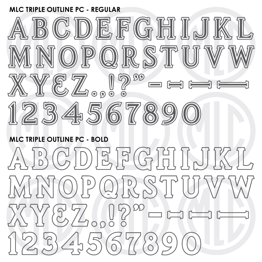
The Triple Outline alphabet was designed by Anthony Gaspari, who designed all of the PALL Canada plastic die-cutting alphabets. Gaspari designed the alphabet to contain a frosted or raised polish strip, adding extra embellishment to the family name on a memorial. Because it was intended solely for large family names, the alphabet was very limited, with no punctuation or numerals included, and available only in 2″, 2.5″, 3″, 3.5″, and 4″ sizes. Later, after PALL’s alphabets were discontinued, the PMD company revived the alphabet, but only at the 3″ size. This alphabet saw most of its use between the late 1960s until the mid-1970s. Never wildly popular, the alphabet did receive moderate usage in specific geographic areas and was later digitized in the Craftech monument design software, as well as in Monu-Cad under the name “Triple Cut”. The alphabet was often used without the innermost outline, creating a double outline, or frosted outline alphabet.
Distinguishing Features
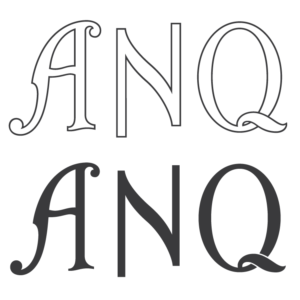
Other than its 3 outlines, the alphabet is most obviously set apart by the angle on its serifs, not typical of lettering styles in the memorial industry. These serifs were used traditionally in the sign-painting industry and were sometimes referred to as “Detroit serifs”. Gaspari did design a second alphabet with this feature; the PALL Polished Edge. The PMD company later created a Condensed Polished Edge in the same style, for their Cutrite line of stencil press alphabets.
Characters
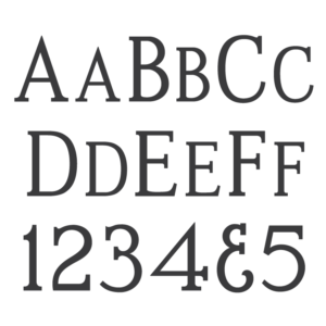
The alphabet contained no numbers, and no ampersand or punctuation. The MLC decided to add numbers and full punctuation to the alphabet, as well as diacritic marks and extra Latin-based characters for multilingual support. The numbers were based on the very similar PALL Polished Edge alphabet. Unlike most MLC fonts, the Triple Outline does not include “small-caps” for the lowercase characters, due to the intricacy of the three outlines. The MLC also created a second version of the font that does not include the central letter shapes, creating a very bold frosted outline alphabet, which was a stylistic variation of the alphabet often created by monument shops by not removing the center shapes when picking the sandblast stencil. It should also be noted that the actual alphabet was slightly smaller than the given sizes, so to match more closely a 2″ alphabet should be given a 1.98″ or 1.99″ size in the computer software. The sizes of the letters, as well as the thicknesses of outlines varied from letter to letter. The MLC “normalized” these sizes, so the characters will match each other more closely than they did in the original plastic alphabet.