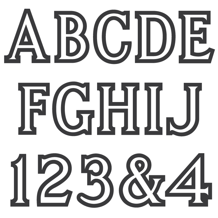
Description
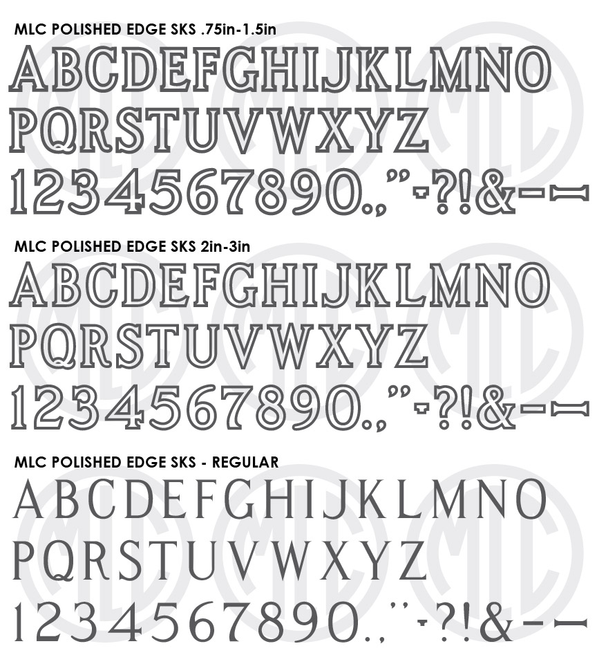
* Only the basic character set is shown here. For a sample character map see the MLC Font Project page. Alternate characters shown in grey.
Classification
Monument Roman: Outlined
Usage
The ScotchKut Polished Edge alphabet was not a part of their initial 1968 offering but was created in the early 1970s as a response to PALL Canada’s Polished Edge alphabet. The SKS Polished Edge alphabet has seen moderate usage since its creation, and was digitized in the Monu-Cad software under the name “Polished Edge”.
History & Designer
The MLC currently has no information on the designer of the alphabet. The alphabet contains a wider outline than would be typically seen on lettering with a sandblasted incised outline, used instead to leave a wide polished stone surface outlining the letter. The concept of the polished edge letter dates far earlier than any physical letter set, and prior to their creation many monument shops would hand draw the bold edge around their letters to create the effect.
Distinguishing Features
The straight serifs distinguish this version of the Polished Edge alphabet from the angled serifs of the PALL Polished Edge. The leg of ‘R’ also distinguishes this alphabet from other Roman style Outlined or Polished Edge letter sets. The leg is very straight, and rather than squaring off it contains a rounded end. This trait is also present on the ‘3’, ‘5’, ‘6’, and ‘9’. The SKS Polished Edge alphabet contains 2 different outline thicknesses at specific size breaks–a bolder outline or “edge” at .75″ through 1.5″, and a thinner outline at 2″ through 3″–Strangely, there were no 1.75″ sets made. The inside lines of the Polished Edge letters differ from all other Outlined alphabets in that they contain pointed serifs, similar to a hand-cut Spacerite letter where the stencil cutter saved time by creating a point at the end of the serif instead of cutting out the square edges. As with all other outlined MLC fonts, a non-outlined version has been included in order to add a custom outline thickness to the letters in your design software. In this case, the outside lines will not look similar to the outside lines of the actual letter sets, as the inside and outside lines on the actual alphabets do not follow the same curves.
Characters
The SKS Polished Edge sets contain a fairly full set of punctuation, including an ampersand, two dashes at different lengths, a comma, and a period. There were no alternate characters included, but as with all MLC fonts, there are several versions of lowercase ‘c’ and some other alternates. These characters have been included as OpenType alternates when using software that supports OpenType features.

