Description
Both an outlined version, and a non-outlined version are included with the download.
* Only the basic character set is shown here. For a sample character map see the MLC Font Project page.
Classification
Monument Roman: Bold/Outlined
Usage
This style of alphabet has seen moderate usage since the sometime around early 1990s.
History
Typically very poorly drawn, this alphabet style has been given many names; including Roman Outline, Double Outline Roman, and Roman Bold/Bold Roman. The style has a number of versions, available as either an outlined or non-outlined font. The MLC believes this alphabet to have been first created digitally (not as a physical letter set), based closely on Spacerite Double Outline metal alphabet with minor changes and wider geometry.
Distinguishing Features
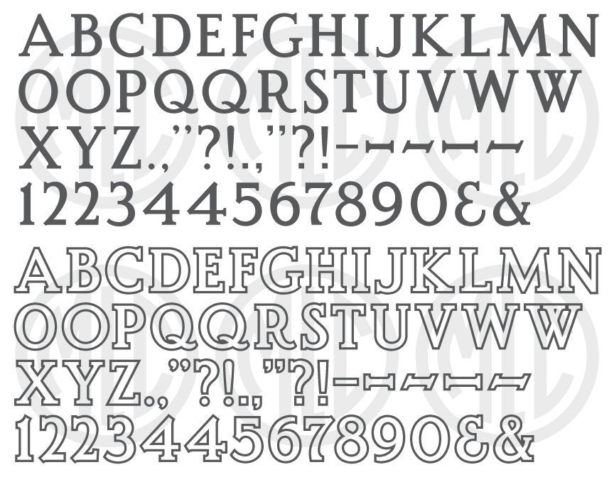
With the exaggerated tail of ‘R’ and widths of ‘A’ and ‘M’, as well as the inconsistent stroke widths and typically blocky serifs, the entirety of the alphabet looks to be more a bit of a caricature of a properly crafted roman style font. Coupled with the often poor vector drawing and outlined nature, the style often tends to make a memorial look more like the title for a cartoon rather than a dignified memorial. To be fair, this issue pertains to all bold roman fonts to varying degrees, especially those which are outlined and frosted. As mentioned above ‘R’, ‘A’, and ‘M’; as well as ‘G’, ‘P’, ‘1’, ‘2’, 4′,’5′, and ‘7’ all help in identifying this style. The spur at the base of ‘G’ and the exaggerated tail of ‘R’ are somewhat obvious at first glance. ‘M’ and ‘A’ have quite strange angles, where ‘A’ seems to be unbalanced and leaning to the left, and the right half of ‘M’ the opposite, which creates an inconsistent angle of the diagonals. ‘R’ and ‘P’ tend to have a bowl made up of too thin and/or consistent a stroke which does not properly convey the variance a flat brush or nib would make when writing the letter. ‘1’, ‘2’, 4′,’5′, and ‘7’ all contain spurs at various points which are similar to those first used in the Spacerite Double Outline alphabet. The crossbar of ‘4’ and ‘2’ do not usually contain serifs, though at least with ‘2’ this is not always the case. The MLC has drawn the letters in an attempt to correct many of the shortcomings of existing versions, while using similar enough proportions and style needed to match existing inscriptions without appearing entirely different. Improvements to the angles of diagonals, stroke widths, and serif consistency were all taken into account in drawing the letters.
Characters
The alphabet’s punctuation differs wildly among different versions, but usually either circular or square style periods/commas are utilized. Two styles of ampersand, ‘2’, and many styles of dashes are common as well. The MLC has included both styles of punctuation (with the circular being primary), ampersands, and ‘2’s, along with many styles of dash. Also added are alternates for ‘O’, ‘Q’, ‘W’, and ‘4’. The wider, more circular ‘O’ and ‘Q’ were added to give the style more of a Classic Roman feel when used. Though never seen before in this style, the alternate ‘4’ contains a serif on the crossbar was added. These alternate characters are available as OpenType alternates when using software which supports OpenType features.