Description
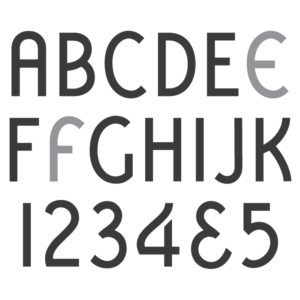
* Only the basic character set is shown here. For a sample character map see the MLC Font Project page. Alternate characters shown in grey.
Classification
Decorative Roman
Usage
Never wildly popular, this alphabet received moderate usage between the 1940s and the 1960s–at which point it began to decline. Though it was digitized in the Craftech memorial design software in the 1990s, the alphabet never regained popularity and the software has since been discontinued. Most notably, this alphabet was used on the family monument of famed painter and illustrator Normal Rockwell.
History and Designer
The designer and exact date of creation of the alphabet is unknown, but it was created by at least 1940. The most likely date of creation is between 1934 and 1936, due to the fact that only early alphabets contain the raised “pat.” markings used for the first 8 years after the company received their patents; one in 1926 and one in 1928. The McNeel Monument Company also advertised a hand-drawn lettering style named De Luxe Roman in their design books around the same time, but it is unknown whether the Spacerite company was inspired by the McNeel company, or vice versa. In later McNeel books the name was changed simply to “Delux”. The Spacerite alphabet was sometimes also listed as “Deluxe” Roman in certain trade catalogs, though the metal letters themselves brandish the “De Luxe” name containing the space. This style was one of only two available by the Spacerite Company as a “Designer’s Alphabet” at 1/4″ tall (the other being the Vermarco), used by designers for creating sales proof drawings.

De Luxe Roman used on a gravestone.
Distinguishing Features
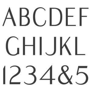
The most obvious distinguishing characteristic of this alphabet is its rounded serifs which curve inward at the center towards the stem, giving the alphabet a more decorative feel. The letter geometry follows more closely to a Classic Roman than a Modified Roman–the more circular letters being wider. The leg of ‘R’ is more prominent and curves up slightly higher than a typical Modified Roman, and ‘E’ is noticeably narrower at the top than it is at the bottom–a feature that is somewhat present in most industry Roman alphabets, though here it has been exaggerated. ‘U’ contains spurs at either side of the base of its curve while ‘J’ does not; and ‘P’, ‘6’, and ‘9’ do not reconnect to themselves where they typically would near the center of the character, instead containing a small gap. The Numeral ‘1’ has a slight hook at the top, aiming back away from its stem.
Characters
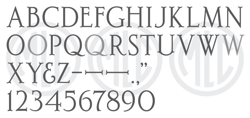
The MLC is not aware of the alphabet containing any punctuation other than a bullet and dash. The MLC created all other punctuation to match the style of the letters. An ampersand was also included with the alphabet, as well as a second slightly wider ‘O’ and ‘Q’. Two versions of ‘W’ were included; one constructed by overlapping two ‘V’ shapes, and a second with a center apex. These alternate characters are available as an alternate when using software that supports OpenType features.
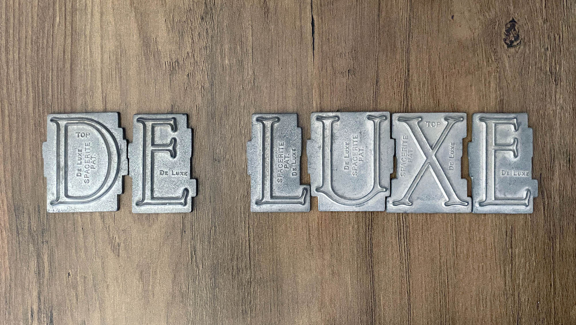
Metal Spacerite De Luxe Roman letters.