Description

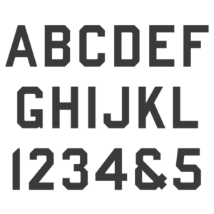
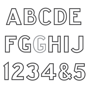
* Only the basic character set is shown. For a full character map sample view the Font Project page. Alternate characters shown in grey.
Classification
Vermarco
Usage
Created for sandblast work, this Art Deco inspired sans-serif alphabet saw most of its use from the late 1930s until the late 1960s. In 1968, with the creation of the stencil press, the baton was passed to the nearly identical ScotchKut Vermarco, though the Spacerite letters are still used by some headstone manufacturers today.
History
Originally a metal type alphabet created in 1937, the Spacerite Vermarco is the original standardized Vermarco font – though it has its roots in various other similar lettering styles used throughout the 1920s and 30s. Named after the VER(mont) MAR(ble) CO(many), it is the style on which all other Vermarco alphabets are based. The involvement of the two companies in creating and naming the lettering style is currently unknown by the MLC. The Vermont Marble Company later went on to officially use the Vermarco name when it filed for a Word Mark in 1949.
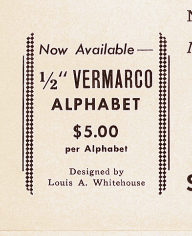
1940 1/2″ Spacerite Vermarco advertisement by Louis A. Whitehosue.
Designer
The designer of the Vermarco alphabet was Louis A. Whitehouse, as confirmed by a 1940 Spacerite Company mailing advertisement in the MLC’s historical archives. Whitehouse was chief designer for the Vermont Marble Company at the time–hence the name of the alphabet. The mailer is for the Spacerite Double Outline Frosted alphabet, and a small section is shown advertising the newly created half-inch version of Vermarco, three years after its initial release.
Distinguishing Features
Mostly mono-line in nature, the letters do not vary in width except for the tail of ‘Q’ and the curves of ‘N’ and ‘U’ as they approach the stem. Few features will help in distinguishing the alphabet from the later ScotchKut Vermarco but helpful are the round inner tail of ‘Q’ as opposed to square; the stem and curve of ‘N’ and ‘U’ protruding higher and lower than the cap height and baseline, respectively; and the somewhat straight leg of ‘R’, where the ScotchKut displays a much more curved leg. The remaining differences are so minimal they remain unrecognizable to the naked eye.
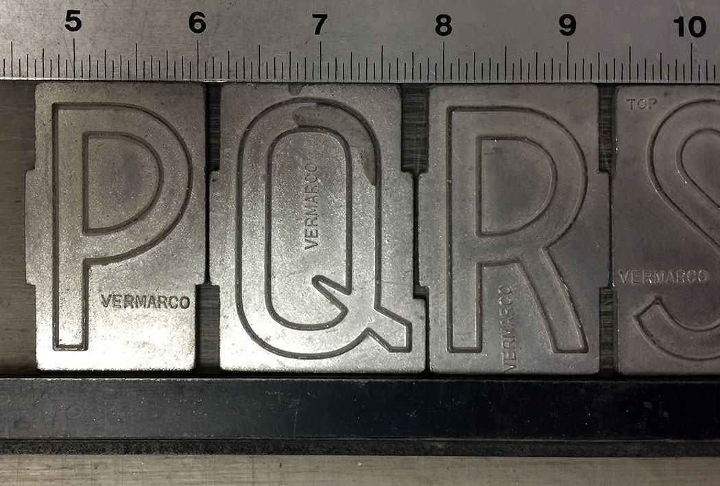
Spacerite Vermarco letters, note the rounded inner tail of Q and slight curvature of the leg in R.
Characters (Updated 12/15/2018)
The original alphabet contained no punctuation, and because of this all punctuation has been created by the MLC. The ampersand was created by reversing the 3 and adding a longer lower finial, typical of many monument alphabets, and indeed a similar ampersand was eventually created for the later Double Outline version of the Vermarco alphabet. As of Dec. 15 2018, the rare alternate ‘E’ and ‘F’ characters have been included in the font. If you have previously purchased the font, log in to download the update. The MLC had known of their existence in the Spacerite Double Outline Vermarco, but was unaware of their inclusion in the regular Vermarco font until only recently, when a set containing the characters was found. These characters were originally not included in the metal sets, but were likely added by the Spacerite Company later on at an unknown date.