The Lettering of Lady Liberty
On the aptly named Liberty Island (formerly Bedloe’s Island until 1956) in New York Harbor, New York, stands a monumental statue by French artist Frédéric Auguste Bartholdi, commemorating American independence. Liberty Enlightening the World, or “The Statue of Liberty”, holds a torch and a tablet bearing the date of America’s Declaration of Independence. The statue contains little lettering, and its base was originally completely devoid of lettering—but that won’t stop the Monument Lettering Center from writing a detailed article about it!
The Tablet Lettering

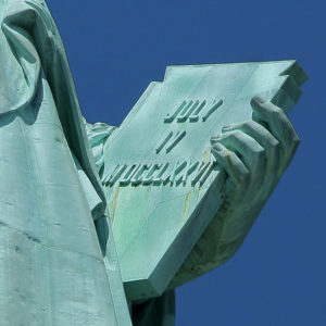
Liberty Inscription. Modified photo by Daniel Schwen / CC BY 4.0.
The only lettering on the statue itself appears on the tablet that is held in Liberty’s left hand. Her right hand of course holds the famed golden torch. The raised lettering on the tablet reads “JULY IV MOCCLXXVI”, or July 4, 1776. It is in a block style with slightly rounded corners, often historically referred to as ‘Egyptian’, ‘Round Corner Gothic’, or ‘Commercial Gothic’. This style of lettering became extremely popular for monumental work in the United States during the middle half of the 19th century. By the early 1900s, though, many in the monument industry were beginning to look down on the style due to its plainness and heavy use in advertising, giving it defamatory names such as ‘So-Called Gothic’ and ‘Common Gothic‘. In literature at the time, the style was often noted for at least being very legible, which is likely the reason Bartholdi decided to use it on the tablet—though he may also have known of its popularity in the United States during the late 1860s while the statue was being designed.
It is interesting that the date is calculated using the classic roman numerals, while “JULY” is written using the capital ‘J’, and ‘U’, neither of which were present in the Roman alphabet, but were both added to our modern alphabet separately over several hundred years. In fact, the letter ‘U’ was not officially accepted by the French until around 100 years before Bartholdi began work on the statue. Using roman numerals is still common in architecture and large-scale monumental work as a sign of class and prestige, though in these cases the classic roman alphabet is typically also used for the lettering. If Bartholdi had gone this route the letters ‘I’ and ‘V’ would have been used. Perhaps Bartholdi feared that “IVLY” would be too confusing for the reader, though it can hardly be assumed that someone viewing the lettering from 95 feet below (distance from tablet to toes) would have an easier time reading and calculating “MOCCLXXVI”. The statue in fact sits on a pedestal 89 feet tall and on a foundation another 65 feet tall, making it further difficult to read the lettering from the ground.
The Lettering on the Cornerstone

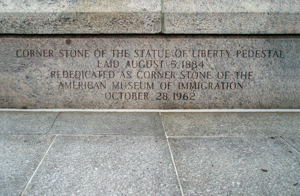
Spacerite Modified Roman text on the Liberty cornerstone. Modified photo by Eddie~S / CC BY 2.0
The inscription on the cornerstone of the pedestal was not added until 1962 when it was rededicated by the American Museum of Immigration. The inscription reads:
Corner stone of the Statue of Liberty pedestal
Laid August 5, 1884
Rededicated as corner stone of the
American Museum of Immigration
October 28, 1962
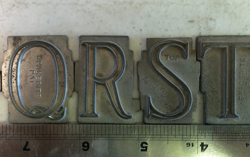
The lettering style sandblasted into the granite cornerstone is Spacerite’s Modified Roman. The Spacerite company created metal alphabets for the monument industry beginning in 1925, and this alphabet is the most common lettering style on monuments and memorials in North America. The Spacerite Modified Roman was also the inspiration for many other later versions of modified roman alphabets created for the industry, including Presto Cut’s Modified Roman, SKS Modified Roman, and PALL Canada’s Modified Roman which differs the most from Spacerite’s original. The Spacerite company would also go on to create a metal Round Corner Gothic alphabet, similar in style to that of the inscription on the tablet of the statue.


