Description
*Use coupon code “art35” to receive $35 off when purchasing a license for both this and the PMD Cutrite Art-Line font, or the ERP Frosted Bar font at the same time.
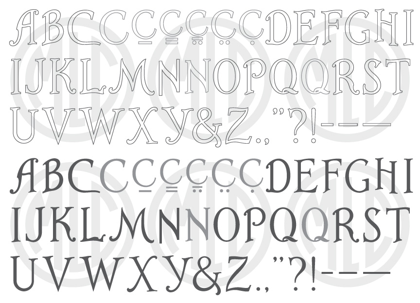
* Only the basic character set is shown here. For a sample character map see the MLC Font Project page. Alternate characters shown in grey.
Classification
Surname, Decorative Initials
Usage
The Art-Line alphabet was designed as a sandblast alphabet of drop-cap or decorative initials to accompany the outlined lettering in a family name on a memorial. The alphabet was fairly widely adopted by the industry during the 1960s, seeing a slight decline after the 1990s because it was never digitized in any memorial software–though a later version by PMD International was digitized and included in the Craftech software until it was discontinued.
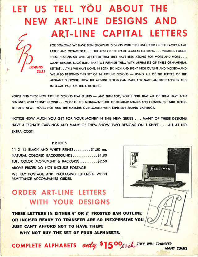
Art-Line advertisement from an ERP memorial design brochure circa 1960.
History & Designer
This alphabet was designed in the mid to late 1960s by Edward R. Peterson, of Peterson Memorial Design Service, for his Alphabet Transfer Series. The letters were drawn by Peterson and reproduced as a set of four 8.5×11″ packets for tracing. The packets were sold with or without an outline, at both 6″ and 8″ heights. Much like stencil press letters, each letter was printed backward to accommodate the transfer process. Because of this, ambigrams such as ‘W’ or ‘M’ were sometimes mistakenly used backward on a stone when the intended transfer method was bypassed. Peterson released the alphabet series with an accompanying set of Art-Line designs. Peterson’s Art-Line alphabet was featured in a section on “Decorative Capital Initials” in the 1967 book “Basic Styles of Lettering for Monuments and Markers” by Edward Stockinger, printed by the MBNA (Monument Builders of North America). The style has also been referred to as “Hallmark” lettering when the original name was unknown.
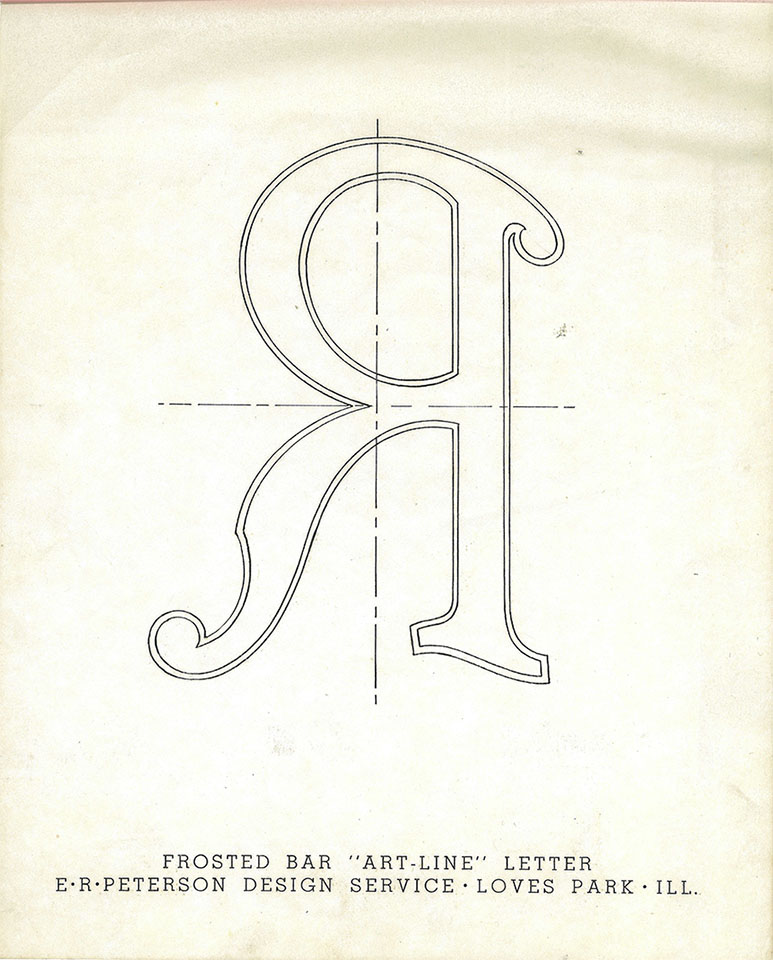
The letter ‘R’ from Edward R. Peterson’s Alphabet Transfer Series “Art-Line” booklet.
Distinguishing Features
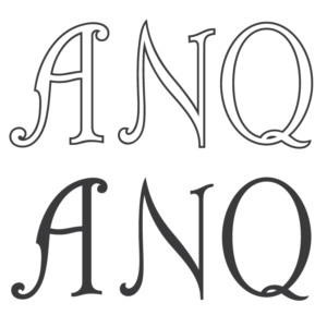
Though Peterson designed the original, a second version was later created as a stencil press alphabet by PMD International for their Cutrite line of stencil press plates. Peterson’s original version can be identified by its slightly bolder weight, and some major differences on various letters including ‘N’ and ‘Q’, as well as many minor differences in most letters. Peterson designed the ‘N’ as a Sans-Serif letter, while no other letter which would naturally contain serifs was designed this way in his alphabet. The MLC has included a version of the ‘N’ with the same design but with serifs added–and the later PMD version uses an entirely new design for ‘N’. Peterson’s ‘Q’ contains a tail which uses the outline to show the tail overlapping the letter, which was re-designed in the PMD version.
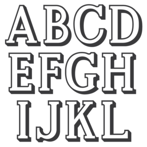
Characters
Due to the nature of the alphabet being made up solely of capitals used to add embellishment to the first letter of a family name, no numbers, punctuation, or lowercase were included. The MLC has also included the incised version which does not contain an outline. This version may be useful with no outline or when a designer would like to add an outline of a different thickness than was included with the original. All punctuation was created by the MLC, and the Monument Lettering Center also created alternate versions of the letters ‘C’, ‘Q’, and ‘N’; which are available both as lowercase letters, or as OpenType alternates in software that support OpenType features. Roman numerals have been used in place of numbers, and although the likelihood of needing the features is rare, all kerning and diacritic marks for multi-lingual support typical of MLC fonts has been included.
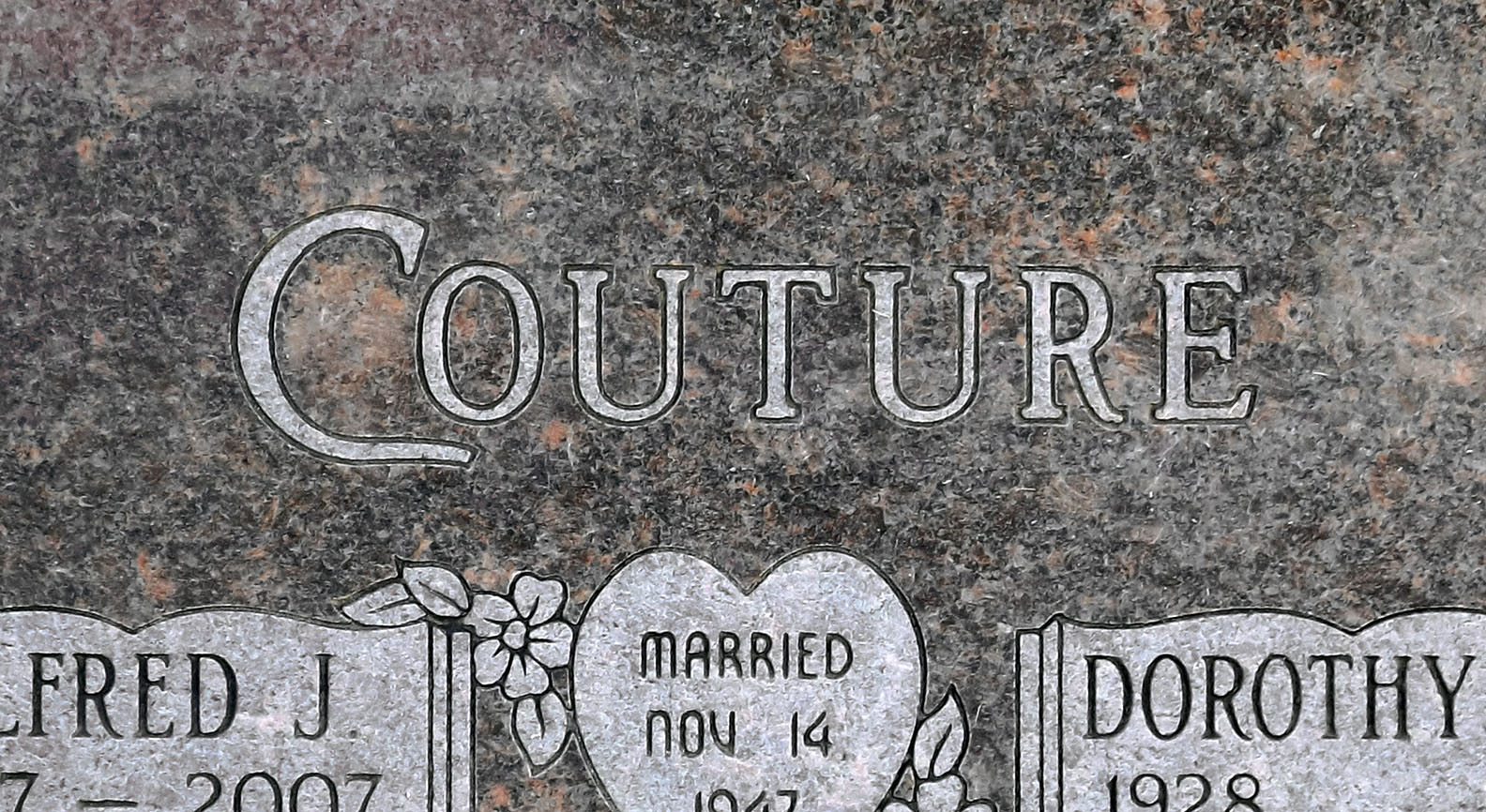
Art-Line capital ‘C’ used for a family name on a memorial.