Description
*Use coupon code “art35” to receive $35 off when purchasing a license for both this and the ERP Art-Line font at the same time.
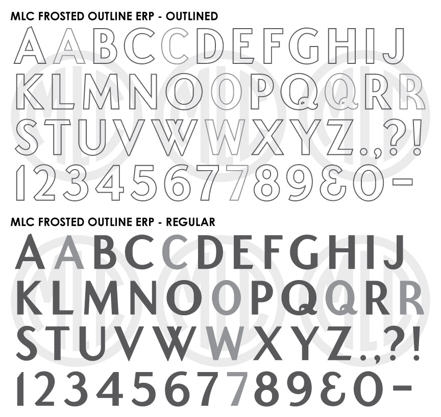
* Only the basic character set is shown here. For a sample character map see the MLC Font Project page. Alternate characters shown in grey.
Classification
Monument Sans-Serif, Frosted Outline
History & Designer
This alphabet was designed by Edward R. Peterson of Peterson Memorial Design Service to accompany his Art-Line alphabet. Unlike the Art-Line letters, which were produced individually on 8.5″x11″ tracing sheets, the Frosted Bar letters were printed together as a full-size poster alphabet. Peterson likely published the Frosted Bar alphabet in the mid-1960s since his Art-line letters were designed sometime around 1959.
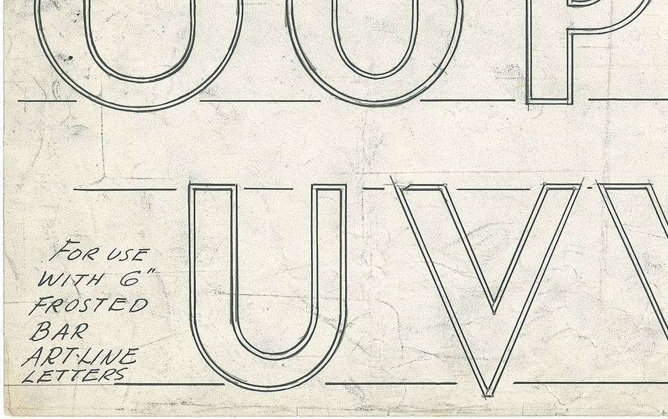
A section of the ERP Frosted Bar alphabet poster.
Distinguishing Features
The alphabet generally follows the same design as many monument sans-serif alphabets of this era, with stylistic emphasis given to the legs of the ‘R’ and ‘K’, which taper at the top. Additionally, ‘A’ is notched at the apex, ‘W’ is made up of two ‘V’ shapes, and ‘E’, ‘L’, ‘T’, ‘Z’ all have angled horizontal bars at the top and/or bottom. Instead of utilizing a true oval, Peterson gave the larger curved characters (C, D, G, O, and Q) a short flat section at the center of the curve.
Characters
The original alphabet contained no numbers, punctuation, or lowercase letters. The MLC added numbers based on those drawn by Peterson and other industry sans-serif alphabets. The MLC also included small caps for the lowercase letters. The MLC has also included an incised version which does not contain an outline. This version may be useful with no outline or when a designer would like to add an outline of a different thickness than was included with the original. The MLC created all punctuation, and the Monument Lettering Center also created alternate versions of several characters, which are available as OpenType alternates in software that support OpenType features. Most notable is the ‘R’, which is based on an alternate ‘R’ drawn by Peterson in many of his design prints. Multi-lingual support typical of MLC fonts has also been included.
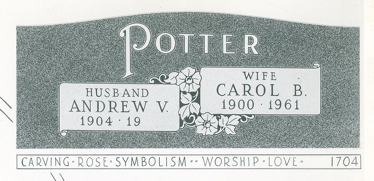
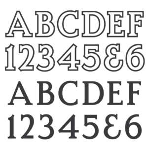
Edward R. Peterson design print 1704 displaying both ERP Art-line and Frosted Bar alphabets.