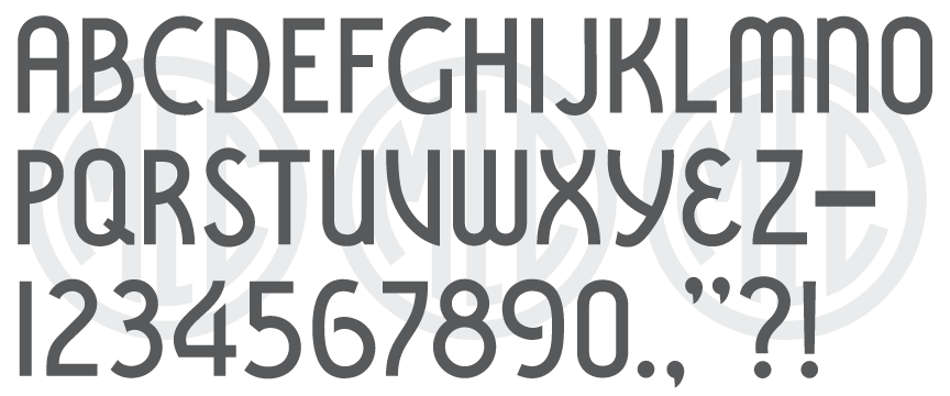
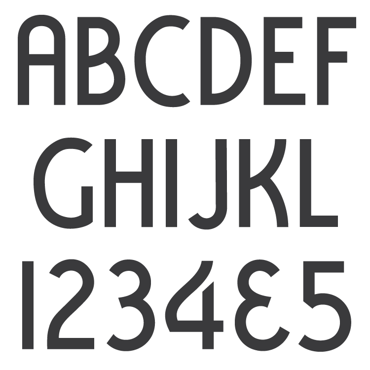
Description

* Only the basic character set is shown here. For a sample character map see the MLC Font Project page.
Classification
Vermarco
History & Designer
This alphabet was designed by Anthony Gaspari, who designed all of the PALL Canada plastic die-cutting alphabets. The alphabet saw most of its use between the late 1960s through the mid-1970s.
Distinguishing Features
Along with the Scotchkut version which was also produced in 1968, the PALL version was based on the original Spacerite Vermarco. Gaspari’s rendition is more condensed and contains ‘6’s and ‘9’s with notably flatter backs than the typical oval shape. The numeral ‘8’ is made up of two circles instead of the original “figure-eight”, zero is not oval but has flat sides like ‘O’, and the terminal at the bottom of ‘Y’ contains an extremely awkward sharp angle or hook rather than a smooth curve like the Spacerite original. Additionally, the tail of ‘Q’ is much thicker on the inside of the counter giving it a blocky feel, the stem of ‘4’ does not come up as high as usual, and the bottom of ‘5’ is more traditionally round than both the Spacerite and ScotchKut versions.
Characters
The alphabet contained the standard plastic die-cutting alphabet punctuation (dashes, periods, and commas) and an ampersand; all other punctuation and extra characters have been created by using other monument industry Vermarcos as a guide.


