
Description
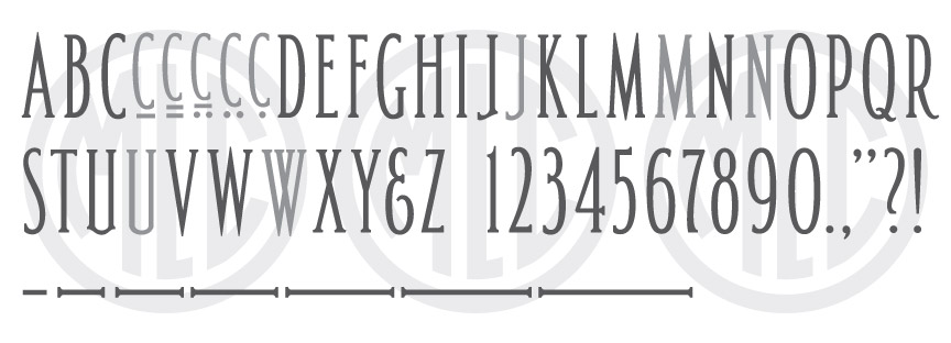
* Only the basic character set is shown here. For a sample character map see the MLC Font Project page. Alternate characters shown in grey.
Classification
Condensed Roman (Ultra-Condensed)
History and Designer
The creator of this alphabet is likely Edward S. Carter, a memorial designer and lettering expert who is believed to have created the alphabet, with a slightly different serif treatment, for use on the covers of the Monumental News magazine for the year of 1939. Carter became associated with the magazine around 1937, writing many articles on design and lettering. He was also working as a designer for Marr & Gordon during this same period, and it seems he used a similar ultra-condensed letter style for their redesigned company logo. The alphabet was later adapted for use as a metal Spacerite alphabet by at least 1950, but likely during the mid-to-late 1940s. Carter also possibly created the Spacerite Uncial Gothic alphabet around the same time.
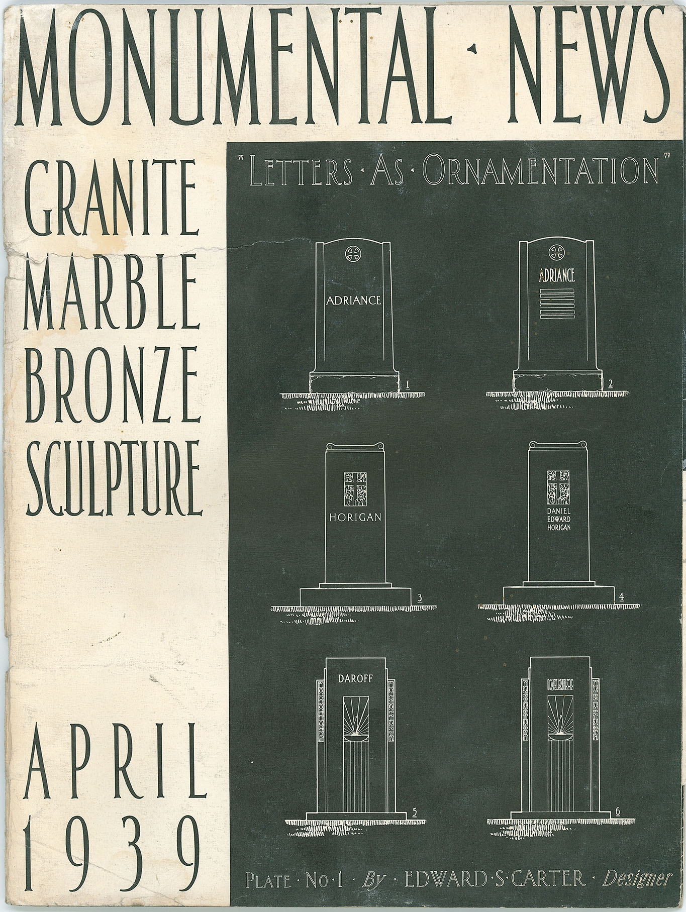
Memorial Designer Edward S. Carter’s Cover Lettering. Monumental News, April, 1939.
Usage
Somewhat rare, this alphabet received limited but steady usage as a metal Spacerite alphabet between the late 1940s and the 1990s. In the mid-1990s, a bolder version of the alphabet was created as a plastic stencil press alphabet by the PMD Company for their Cutrite line, and a poorly digitized version was included in the Monu-Cad software, which appears to have been based on the plastic alphabet, or perhaps even a catalog image of the alphabet and not on the original metal alphabet. Most notably, this alphabet was used on the Barre Italian-American Stonecutter Memorial, dedicated to artist Carlo Abate, and designed by Elmo Peduzzi. The text on the monument reads “In honor of all Italian-Americans whose achievements have enriched the social, cultural and civic vitality of this city, region and state”. The alphabet has also tended historically to be used by other well-informed designers on war memorials, civic monuments, and other high-end memorials due to its fairly uniform letter width, allowing it to be more easily justified for a clean look. This can help make the lettering itself a purposeful element of the design, aiding in its overall beauty and not simply used for informational purposes alone as is so often done with lettering. The alphabet—as its name would suggest—was designed primarily for use when the width of the lettering is of primary importance, making it a good option when a designer desires to match the width of a design panel.
Distinguishing Features
The ultra-condensed width of the alphabet immediately sets it apart from all other alphabets designed for the monument industry. ‘U’ and ‘J’ contain spurs at the base. ‘M’ and ‘N’ did not contain serifs on the top half of the letter as is typical for Roman lettering. The top stroke of the numeral 5 contains an upward spur.

Spacerite Panel alphabet used on a cemetery memorial.
Characters
The MLC is not aware of the alphabet containing any punctuation other than an ampersand and dash. The MLC created all other punctuation to match the style of the letters. Two versions of ‘W’ were included in the alphabet—one constructed by overlapping two ‘V’s, and a second with a central apex. Additionally, the Monument Lettering Center created alternates for ‘J’, ‘U’ with spurs removed; as well as ‘N’ and ‘M’ with serifs added to the top of the letters where they would typically exist. These alternate characters are available as an alternate when using software that supports OpenType features.