Description
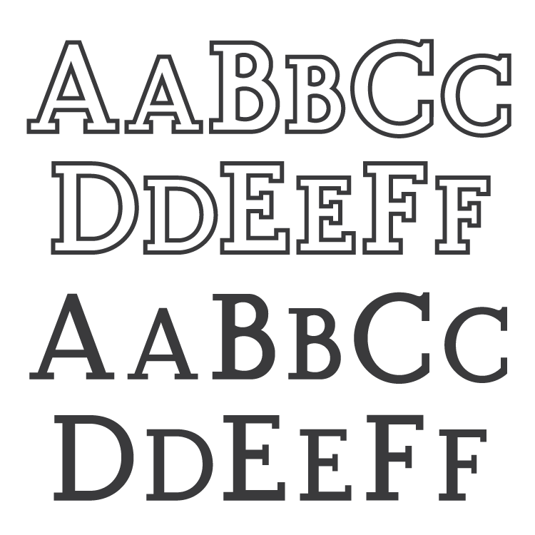
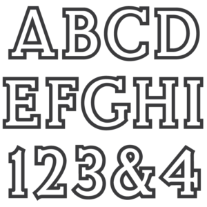
Both the original outlined version, and a non-outlined version are included with the download.
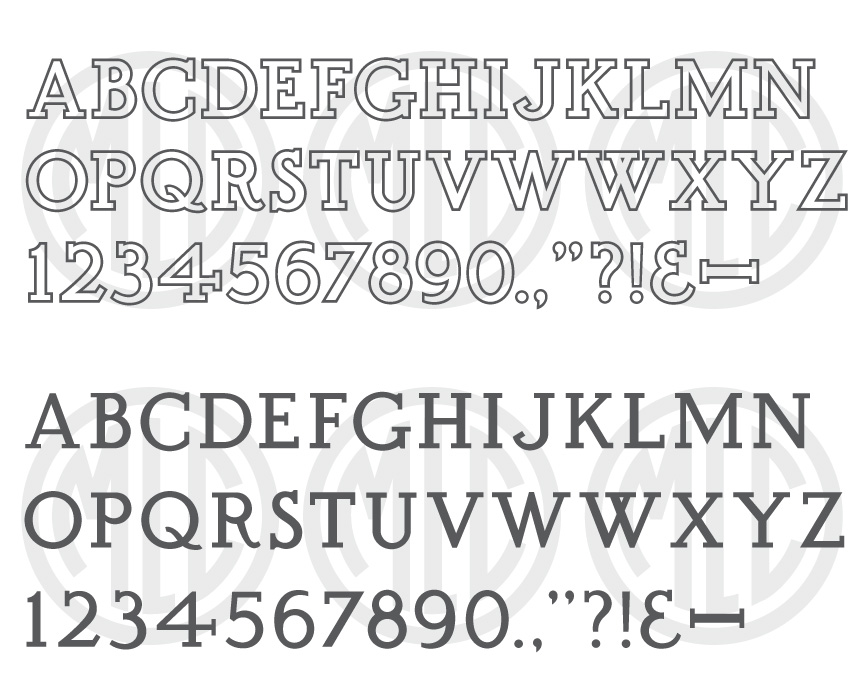
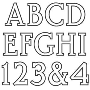
* Only the basic character set is shown here. For a sample character map see the MLC Font Project page.
Classification
Monument Roman: Outlined
Usage
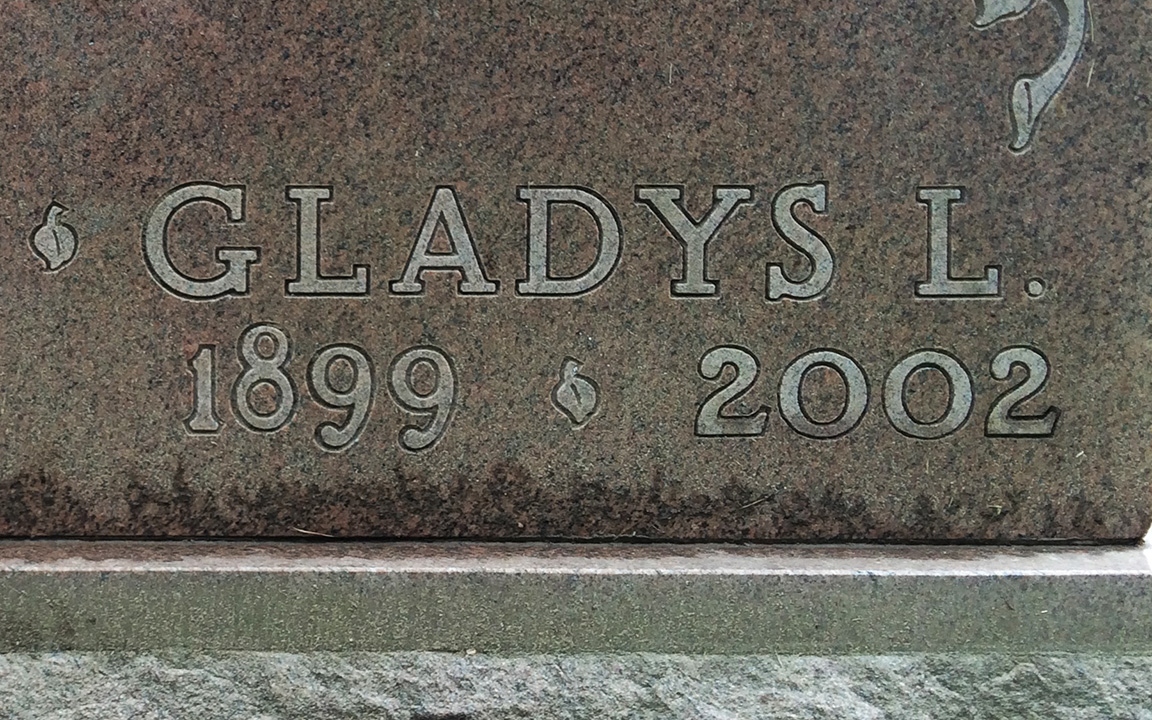
This alphabet saw most of its use between the mid 1970s through the 1990s.
History & Designer
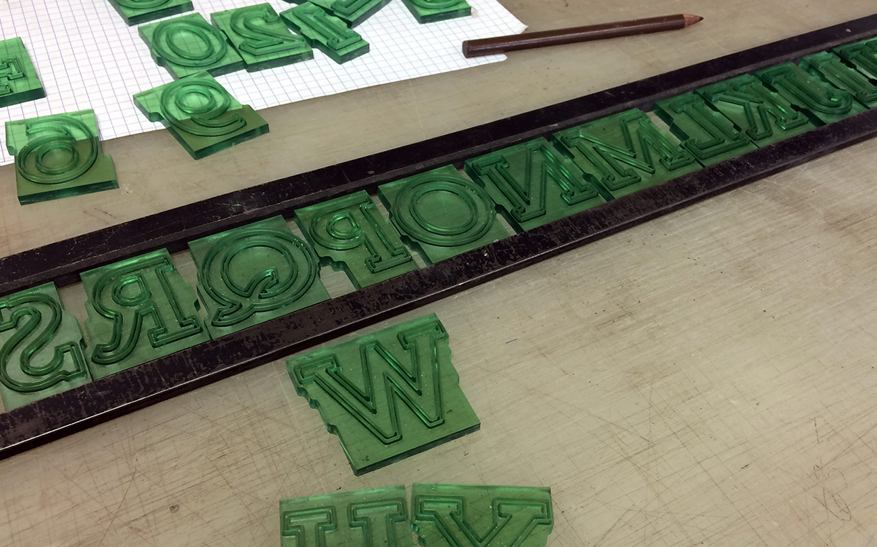
Created as a plastic stencil cutting alphabet, the PMD company inherited the master alphabet molds from the Allied Industrial Sales Corporation which went out of business in the mid 1970s. The original designer of the alphabet is unknown. It is possible that it was created by John Gaspari, but also may have been created by his father, Anthony – who designed all of the PALL Canada alphabets, as well as most of the AISC alphabets around the time of his departure from PALL.
Distinguishing Features
This alphabet is meant to be outlined, and is quite awkward without it. It contains very blocky, slab style serifs. The tail of ‘Q’ does not connect to the left side of the bowl. ‘J’ has a serif at the end of the hook. The bowls of ‘B’ round inward creating brackets at each stem connection, instead of only at the bottom of the lower bowl as is typical of most monument roman alphabets. The crossbar of the 4 is extremely long, extending far beyond the stem. The numeral 8 is made up of two circles, rather than a typical ‘figure eight’ shape.
Characters
The alphabet contained little punctuation, including a dash, a period, and comma; all other punctuation and extra characters have been created by using other monument industry roman alphabets as a guide. The ampersand was created by reversing the 3 and adding a longer lower finial, typical of many modified roman alphabets. The alternate ‘W’ was not included in the original alphabet, but has been added by the MLC. These alternate characters are available as OpenType alternates when using software which supports OpenType features.

