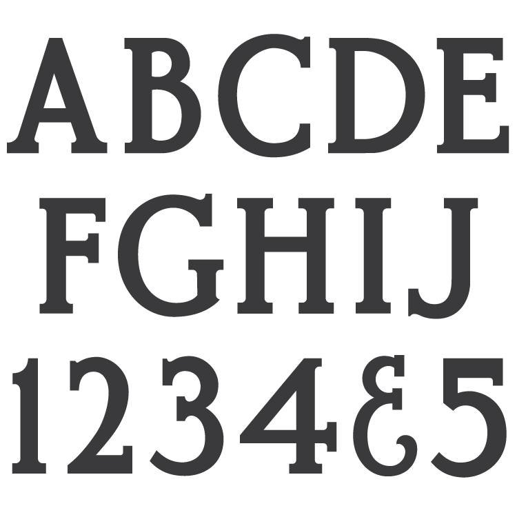
Description
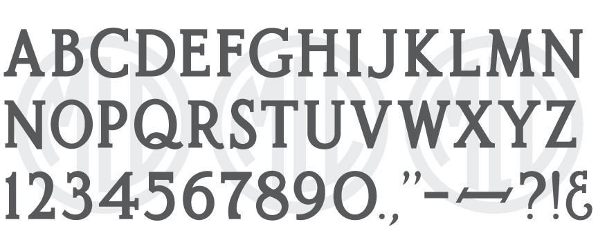
* Only the basic character set is shown here. For a sample character map see the MLC Font Project page.
Classification
Modified Roman: Raised
Usage
This alphabet saw most of its use between the mid 1970s through the 1990s, though due to digitization has continued to receive some regular use.
History & Designer
The original alphabet was designed as a plastic stencil cutting alphabet by Anthony Gaspari for the PALL Canada company in 1968, and was directly influenced by the Spacerite Company’s Double Outline metal alphabet, which was also marketed to be used for raised lettering by ignoring the inside lines. When Gaspari ended his partnership with PALL in the mid 1970s he created a new master drawing of the Modified Roman Raised alphabet for the Allied Industrial Sales Corporation (AISC), his son John’s new stencil press company. Anthony also re-designed several other alphabets, all very similar to the originals he created for PALL but with some changes. The PMD company inherited the master alphabet molds from AISC a few years later when the company filed for bankruptcy in the mid 1970s. This alphabet is also often referred to as simply MRR, it’s acronym, . There are two nearly identical versions in the Monu-Cad software named Lakehead, and Fancy Gothic; perhaps based on the PALL and AISC stencil press alphabets–neither of the versions contain the punctuation from the Cutrite alphabet.
Distinguishing Features
The obvious identifier of the alphabet is the punctuation. The period, comma, and colon are much smaller than is expected for such a bold font, and the ampersand is a lighter weight and more condensed–appearing as if they were drawn for another alphabet entirely. Additionally, the comma has an uncharacteristically sharp angle. It is possible these characters were left out of Anthony’s master drawings, and added later by a less informed draftsman at AISC or PMD.
Characters
The alphabet contained a somewhat full set of punctuation: dashes, periods, commas, colons, and an ampersand. All other punctuation has been designed by the MLC.

