Description
Both the .75″-1″ and 1.25″-3.5″ fonts are included with the download.
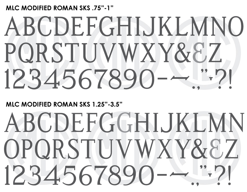
* Only the basic character set is shown here. For a sample character map see the MLC Font Project page. Alternate characters shown in grey.
Classification
Monument Roman: Modified
Usage
The ScotchKut Modified Roman was designed as a plastic die cutting alphabet in 1968 by SKS Ltd., for punching letters through stencil used for sandblasting memorials. This alphabet has been the most widely used lettering style on headstones since the early 1970s, taking over the Spacerite Modified Roman in popularity. Stencil presses are still used by many manufacturers, and the SKS Modified Roman remains the most popular plastic alphabet. It has also been the leading style of modified roman to be used as a base for creating digital fonts in memorial design software. Chances are if you see a modified roman style of lettering used on a headstone with a date between around 1970 and 1995, you’re looking at the SKS Modified Roman alphabet, and after around 1995 it is quite possibly a digital font based on the plastic letter sets.
History
The ScotchKut Modified Roman alphabet was based on the Modified Roman alphabet originally designed by the Spacerite Company in 1925 as a metal type alphabet, used for tracing letters which were then cut by hand in a thick stencil used for sandblasting. In 1968 the SKS Ltd. company began to market its own versions of many of the most popular Spacerite alphabets, along with a few of its own design as moveable plastic letters capable of cutting through sandblast stencil using a press, shortening the time needed to create a useable sandblast stencil. SKS, along with Gaspari and PALL Canada began the stencil press revolution during the same year by marketing these plastic letter sets, designs, and presses to the monument industry. The two companies created separate versions of these fonts which were similar, but also contained several different features. Over the course of the next several years the SKS Company acquired PALL’s stencil press alphabets and designs, and later the SKS Company was acquired by the 3M company, at which point it discontinued PALL’s alphabets and renamed SKS Ltd. to ScotchKut Systems. Because of the discontinuation, the SKS version of Modified Roman is the most common version to find in the cemetery.
Distinguishing Features
The SKS version of Modified Roman, like the PALL Canada version has much thicker serifs than the Spacerite original or the later thicker Presto Cut, though not quite as thick or blocky as the PALL Modified Roman. This change was made to help with the sandblasting process. Listing distinguishing features for the letters in this alphabet is difficult due to the fact that they change depending on the size, unlike the Spacerite Modified Roman which stayed very consistent across sizes. Because SKS Ltd. created different versions at each size, there is not just one ScotchKut Modified Roman, but 11 (from .75″ up to 3.5″ at quarter inch intervals minus 3.25″). There is however one main breaking point between 1″ and 1.25″. Most of the changes between sizes are minor enough that they are quite close when overlaid, but below 1.25″ the letters and serifs are thickened quite drastically to allow for proper engraving at this small size. By creating two versions of the font, the MLC has allowed the user the ability to match the SKS Modified Roman on a headstone in the cemetery very closely no matter the letter size.
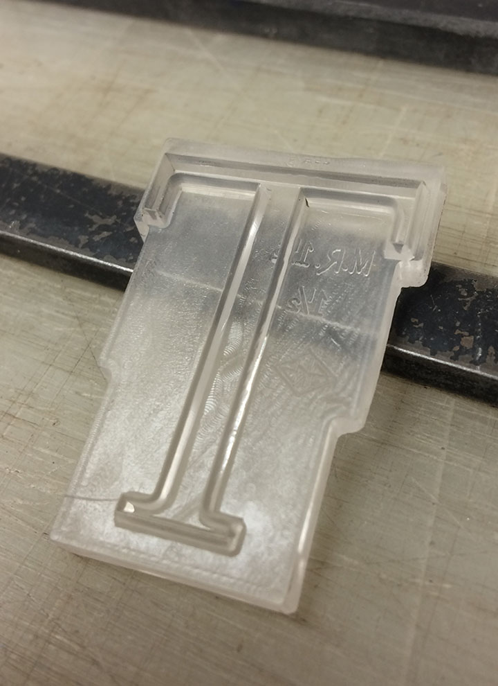
1.5″ ScotchKut Modified Roman ‘T’.
Probably the most consistent distinguishing feature of the alphabet is its ‘W’. At all sizes the SKS ‘W’ tapers in towards the bottom more narrowly than any other Modified Roman, more on the left or right side depending on its size, giving it an almost off balance feel. At large sizes, the top of ‘T’, ‘E’, and ‘F’ all have very thin arms and extremely long serifs. Both of these features make this alphabet immediately noticeable when these letters are present.
Characters
A second version of ‘G’ has been included in the 1.25″-3.5″ font, which was the only character with any noticeable difference at sizes above 2.75″ in the plastic sets. The MLC did not feel that only one letter warranted an entirely seperate font for 3″ and above, but included it as an OpenType stylistic alternate instead, when using software which supports OpenType features. Other than the period, comma, bullet, hyphen, and ampersand, the MLC created all punctuation for the font. A second variation of the ampersand consisting of a backwards 3 with a longer finial has been included as an alternate ampersand, which is a common style of ampersand in many monument fonts.