Description
Classification
Surname/Outlined
History & Designer
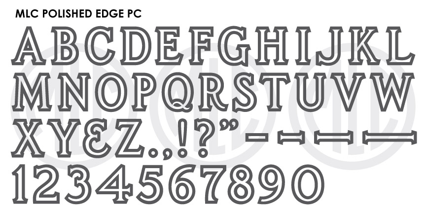
The PALL Polished Edge alphabet was designed in 1968 by Anthony Gaspari, who designed all of the original PALL Canada plastic die-cutting alphabets. Gaspari designed the alphabet to contain a thick outline meant to be used as a raised polish strip, and at least initially was only available at 3 sizes (1″, 1.25″, 1.5″). Several years after the PALL alphabets were discontinued, the PMD company revived the alphabet and produced it at many more sizes, surprisingly even down to 3/4″, but also at 2″, 2.5″, and 3″. This alphabet saw most of its use between the late 1960s until the mid-1980s, but received only limited usage in specific geographic areas in North America and was never digitized in any memorial design software.
Distinguishing Features
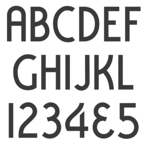
The alphabets most obvious distinguishing feature is its angled serifs, not typical of lettering styles in the memorial industry. These serifs were used traditionally in the sign-painting industry and were sometimes referred to as “Detroit serifs”. Gaspari did design a second alphabet with this feature; the PALL Triple Outline. The PMD company later created a Condensed Polished Edge in the same style, for their Cutrite line of stencil press alphabets.
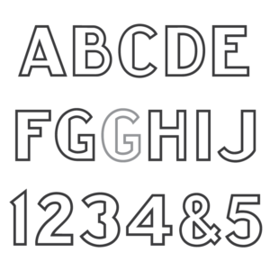
Characters
It is unknown if alphabet contained any punctuation or an ampersand, as none have been found in any plastic letter sets. The MLC added full punctuation to the alphabet, as well as diacritic marks and extra Latin-based characters for multilingual support. Unlike most MLC fonts, the PALL Polished Edge font does not include “small-caps” for the lowercase characters.