Description
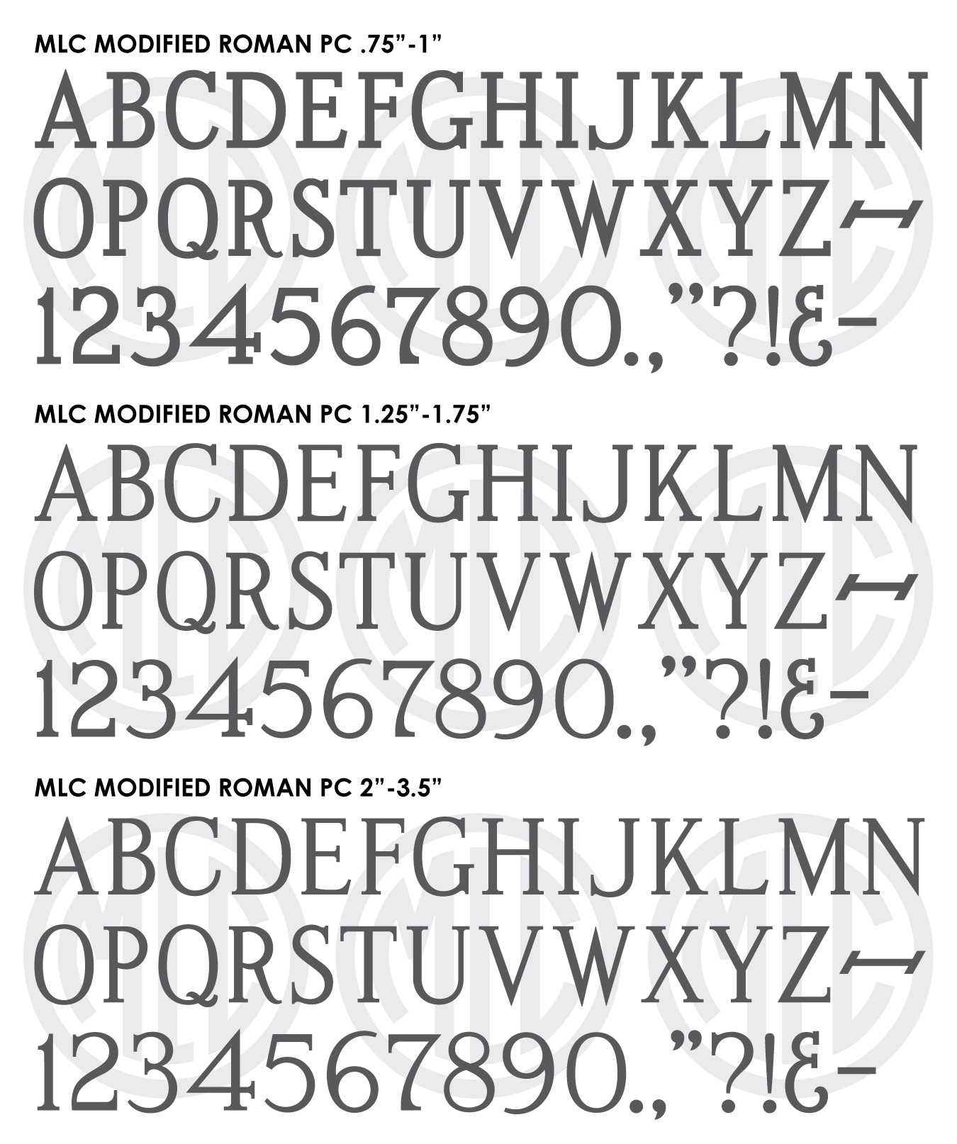
Three fonts are included with the download, one emulating the plastic letter sets at sizes .75″-1″, another for the sizes 1.25″-1.75″, and a third for the sizes 2″-3.5″.
* Only the basic character set is shown here. For a sample character map see the MLC Font Project page.
Classification
Monument Roman: Modified
Usage
This alphabet saw most of its usage between 1968 and around 1975, and was designed as a plastic alphabet for punching letters through sandblast stencil using a press. Stencil presses are still used by some manufacturers, but the PALL Modified Roman was discontinued in the mid 1970s, so it is much rarer to see on headstones manufactured after that time – though a near identical version was later resurrected by the PMD Company.
History & Designer
The PALL Canada Modified Roman alphabet was designed by Anthony Gaspari in 1968, the same year that SKS Ltd. released their Modified Roman. Both companies based their versions on the original Spacerite Modified Roman alphabet designed as a metal type alphabet in 1925. In 1968 Gaspari applied for two patents for a system of plastic stencil cutting letters and a stencil press, and quickly teamed up with PALL Canada to market the system. He designed many letter sets based on Spacerite alphabets, but created a few of his own design as well. Remarkably, in the same year SKS Ltd. (later ScotchKut) also applied for patents for virtually the same system, and both companies were given their patents in 1970. Over the course of the next several years the 3M Company acquired PALL’s stencil press alphabets and designs, and later acquired the SKS, at which point it discontinued PALL’s alphabets and renamed SKS Ltd. to “ScotchKut Systems”. Because of the discontinuation, the SKS version of Modified Roman is the most common version to find in the cemetery after around 1975.
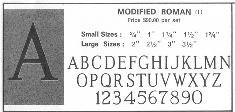
Image from the original PALL Canada binder.
Distinguishing Features
Much like the SKS version, the PALL Canada Modified Roman has much thicker serifs than the original Spacerite letters on which they were based. This change was made to help with the sandblasting process, which allows for deeper, more consistent engraving. Because Gaspari created different versions of the alphabet at varying sizes, there is not just one PALL Modified Roman, but 9 (Small sizes: .75″ through 1.75″ at .25″ intervals; and large sizes which contained no numbers or punctuation: 2″, 2.5″, 3″, 3.5″). Most of the changes between sizes are minor enough to be indistinguishable to the naked eye, but there are 3 main size breaks. At 1″ and below the letters and serifs are thickened quite drastically to allow for proper engraving at such a small size; at 1.25″ and 1.5″ the letters are slightly thinner but still more blocky than their SKS counterparts; and at 1.75″ and above the letters thin out quite a bit more and appear quite close to the larger SKS letters. By creating three versions of the font, the MLC has allowed the user the ability to match the PALL Modified Roman on a headstone in the cemetery at any size.

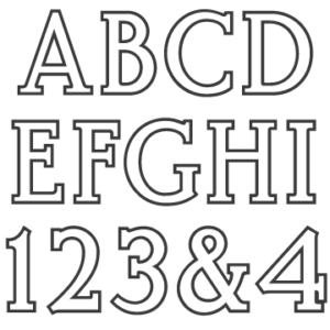
Plastic PALL Modified Roman Stencil Press Letters
The most obvious distinguishing feature of the alphabet is its numeral ‘2’. At all sizes which contain numbers (.75″-1.75″) the serif on the bottom of the ‘2’ is vertical, unlike any other version of Modified Roman, all of which have the serif angle back away from the number. The smaller sizes of the alphabet also are much bolder than any other Modified Roman, and have far more blocky serifs – the .75″ and 1″ sets might even be categorized as “slab serifs”. Additionally the strokes of ‘3’, ‘5’, ‘6’, ‘9’ do not vary much in thickness; almost “mono-line” in appearance, something also not found in another version of Modified Roman. The top serif of ‘3’ on all sizes comes to a point, rather than a square. The bottom stroke of ‘D’ stays straight instead of curving upward as it approaches the stem. The punctuation of the alphabets are uniquely large, and appear around 30% larger than they should be in order to match the strokes of the letters. The dash is unique in that its serifs do not have any bracket, but meet the stroke at sharp angles. The ampersand Gaspari designed for the alphabet is based on the style of ampersand used by the Spacerite company for their Condensed Roman font, and like the other punctuation, looks slightly too thick for the letters.
Characters
The PALL Modified Roman sets contained more punctuation than most monument alphabets, including a dash, ampersand, comma, period, colon, and apostraphe. All other punctuation has been added by the MLC. Because the large sizes of the alphabet contained no numbers or punctuation, the MLC used the smaller sizes as references, and matched the thickness of strokes and serifs to include these glyphs in the fonts.